Sad Comics Reviewed: When David Lost His Voice

David's first grandchild has just been born when he learns that he has terminal cancer. When David Lost His Voice, by Belgian comics artist Judith Vanistendael, is the story of David's last days, framed through the lens of his experiences and those of the women around him. This is sad comics fare on a number of levels: the English translation (from the original Dutch) is beautiful and poignant, the artwork is watercoloury and lovely, and cancer is definitely one of the sadder things to make comics about. Top five at the very least.

Vanistendael's art works within the visual idiom of comics - her characters are cartoony, and the majority of the narrative plays out within panels - but it also transcends the more traditional visual identity of the medium. Or, rather, the art of When David Lost His Voice seeps out beyond the edges of its own constraints. Vanistendael's arresting, vibrant use of colour is tempered by the fact that the book is entirely watercoloured, usually with incredible precision but increasingly chaotically as the narrative progresses. The paint spills over the linework in places, just as the art spills out of panels and onto single- and double-page spreads, breaking down structurally in parallel with David's body and becoming insubstantial with his flesh.

The imagery, too, is gorgeous. Morbid, certainly, but beautiful nonetheless. I'm a total sucker for a good danse macabre, and there's a two-page spread of perfect dancing skeletons to be enjoyed in one of the early sections of the book. Skeletons, unsurprisingly, are a strong visual theme throughout the commic. David's eldest daughter, Miriam, sees his skull staring back at her when she visits her father in his bookshop (I'm also a total sucker for the whole skull-through-the-skin thing). And the cover image of the English translation is of David's wife, Paula, lying in the foetal position next to a skeleton she has constructed out of chopped-up scans of her husband's metastases. It's a very subtle birth/death parallel, and one which echoes the same theme within the narrative - the Dutch cover, interestingly, is somewhat more explicit and less allusive in this regard - and it works.

The narrative is split into five parts. The first and last sections are David's story, whilst the middle three depict the experiences of Miriam, his adult daughter, who has just given birth to her first child, Paula, his young second wife, and Tamar, the eight-year-old daughter of their marriage. Each of the sections is prefaced with a few lines of poetry - something which often doesn't work, but in this case absolutely does. It is very much a story of people not talking about things: Paula is frequently frustrated by her husband's reluctance and failure to communicate with her, and Miriam is hurt when her father waits months before mentioning his diagnosis to her. This theme is more profoundly realised when David's larynx is removed to allow him to breathe more easily - after keeping so much to himself for so long, he has been forcibly silenced, and it is only then (through handwritten notes) that he is finally able to express to Paula in words what he admits he has never been able to say: that he loves her.

However, the book's silences represent more than frustration. After spending his last holiday alone with Tamar doing things intended to delight her, David puts his young daughter to bed, goes out to the back of the houseboat they're sailing around a lake on and smokes a cigarette alone in the dark. It's a powerful scene, and evokes something which would be more or less impossible to do with words.

The words, though, are also incredible in their simplicity. There's something haunting about an eight-year-old child crying out to her father, "Please Daddy, don't die."

When David Lost His Voice is one of the saddest of the sad comics, but there's hope in tragedy - a single robin seen from the window of the hospital canteen while Paula and Tamar hide from the man they love as he dies - and redemption and love in the the final days of David's life, and in his death. It's a thing of splendid, moving beauty, and you should absolutely check it out.


Paul Pope and the One-Trick Rip-Off

The One-Trick Rip-Off Paul Pope has always been something of an artist’s artist, which is why a collection of his work selling for three times the cover price yet you can still rarely find any of the comics he’s created on the shelves. He first appeared in the mid-nineties, with his weird sci-fi tale THB, about boarding schools and giant genie-like creatures that spring into action with the addition of a drop of water. At the same time, he was starting to work on Supertrouble for manga publisher Kodansha. Supertrouble never really appeared, and THB trickled out spordacially, making it hard to collect for even the most dedicated. Heavy Liquid

Sporadic unavailability of his work has been something of a trademark. In 2007 he curated a retrospective of his work, called Pulphope, which quickly became impossible to find (pro tip: do not look at prices on eBay if you've ever given a copy away, it's sickening). Thankfully for those of us who want to own one, Legendary Comics are issuing a new version with additional material in March. In addition, Image are republishing The One-Trick Rip-Off (originally published by Dark Horse) with Deep Cuts, a collection of Pope's mid-90's work (including Supertrouble). Some more recent work will appear in June, when DC finally collects their artist showcase Solo series as a hardback (all of the artists covered in this series are worth looking into).

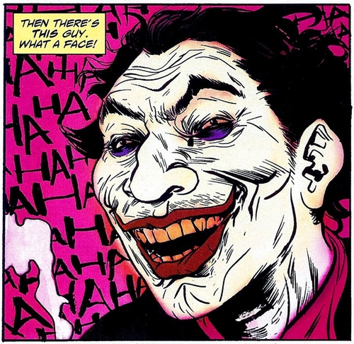
Paul Pope's Joker from SOLO

So why should you grab an opportunity to pick up Pope's comics while they're (hopefully less temporarily this time) about? Because his art is unlike anyone else working today. His brushwork is wildly kinetic while still brilliantly precise. Even when he's writing weird sci-fi, he still writes people well (most of the time). Because even when he's not at his best, he's still more interesting than a lot of stuff on the shelves. And because, after years of dallying with the mainstream, it looks like he might be big enough to make a dent under his own name. Good as Batman: Year 100 was, it needed Paul Pope more than Paul Pope needed it.

At the very least, check out the frequently-in-print 100%. A series of interweaving stories based around the lives of a group of people working in and frequenting a bar - hardly the most original idea, but so deftly handled that it deserves to be read. So do.

Sad Comics Reviewed: Dotter of Her Father's Eyes

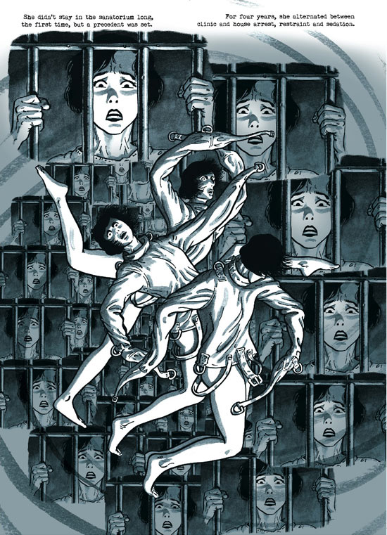
Good news, everyone! Comics aren't just for kids any more! I know we've been saying this for a while - about Watchmen, about Fun Home, about Maus - but we really mean it this time. Adults of impeccable taste who enjoy really good books, as long as they're reliably proven to be literature by the judges of major literary prizes sponsored by famous coffee chains, are finally allowed to read stuff that comes with pictures as well as text. Huzzah! Now, I don't begrudge Dotter of her Father's Eyes its success. I don't begrudge it anything, in fact, because it's splendid. It combines two of my favourite ographies, biography and autobiography, and does so with aplomb. If you're not familiar with Mary Talbot's work on critical discourse analysis, or Bryan Talbot's stint at 2000AD in the eighties and/or taste in bad puns, there's no need to worry. Even if you weren't lucky enough (as at least two thirds of the ConSequential team were) to see Bryan bumming a smoke off someone outside the main hall at Thought Bubble this year, you've got nothing to worry about with Dotter. It's both charming and accessible. Maybe that's why fancy people love it so much.

I should confess at this point that I, too, am fancy people.

Fans of Asterios Polyp will enjoy the fact that the Talbots use no fewer than three different art styles to delineate the boundaries between their present (or near past), their past and the life of Lucia Joyce - bold colours and strong linework for the present, pencil and sparse/muted colour for Mary's youth and a gorgeous palette of dark blues, greys and blacks for Lucia's story. The panels depicting the end of Lucia's life are particularly powerful.

The sections dealing with Lucia Joyce are excellent both in terms of their emotional impact and in the storytelling, dialogue and sheer vivacity of character that they portray, but no good scholar of critical discourse would let us get away with a simple biography. The details and events of Lucia Joyce's life are used to draw parallels between and associations with Mary Talbot's childhood and youth, and it's very much Mary's story, rather than Lucia's, which really steals the show. It's even Mary who crops up on the cover, which almost certainly means something about something.

The two histories in question complement one another well: they're tales which share common themes and threads, but by no means the same outcome. The last years of Lucia Joyce were not happy ones, whereas Bryan and Mary, in spite of their circumstances and setbacks, seem to be doing more or less all right (they've just won a Costa prize, for one thing). And perhaps it's this which makes me feel that their story is more central to Dotter than Lucia's. The life of Lucia Joyce, if treated as a straight biography, would be as sad as the saddest of sad comics. But when similar themes and experiences from Mary's youth are highlighted, and comparisons invited, there's a sense of triumph and a very real glimmer of hope. Lucia could not right the wrongs of the past, but the Talbots may well have managed to achieve that.

In terms of sad comics specifically, there's a lot here for fans of the genre: class issues, daddy issues (both Mary's and Lucia's), thwarted hopes and dreams, parental pressure, incarceration, people doing bad stuff to ladies (at least in part simply because they happen to be ladies at a time when that wasn't necessarily a good thing), living in Wigan, getting knocked up and subsequently married really young because that's the thing to do, and plenty more. Some solid sad comics fare for those of you who enjoy a really sad comic.

I hope that people will read Dotter because it's a fantastic comic, and not just because it's fantastic and also happens to be a comic. I haven't said a lot about panel structure, but the three distinct art styles do interesting things within the medium, and it would be nice to hear some more about that and a bit less about how it's safe to come out of the comics closet now that the middle classes have been reassured (which brings us gently back to class issues. Boom.).

If this hasn't been enough to make you want to go and read Dotter, I'd like to close by quoting James Joyce himself (as Mary Talbot quotes him in the book): "It's enough if a woman can write a letter and carry an umbrella gracefully."

If nothing else, Dotter proves Joyce to be as much of a jerk as that quotation suggests. Enjoy!

The Lengths

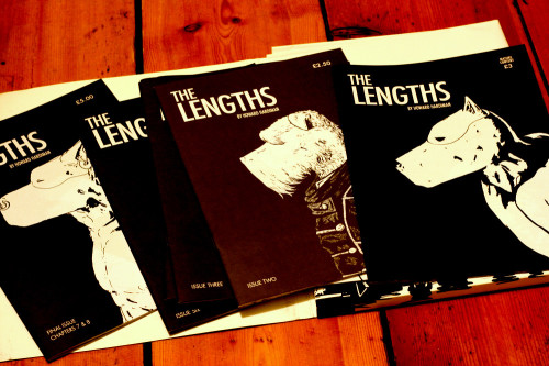
The Lengths - covers

 “I guess every coming of age story winds up reading like the emo Tumblr suicide note of the child you’d thought you’d always be”

Howard Hardiman’s The Lengths was picked up in the New Statesman this week. They've had a lot of good comics writing lately, and this was no exception. After picking up The Lengths myself at Thought Bubble this year, I’d say it definitely deserves the attention.

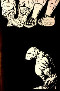
It's the story of Eddie, an art school drop-out struggling to hold his relationships together, and Ford, a fledgling rent boy with a broadening callous streak. They are the same person, and The Lengths is about tangling and untangling those identities.

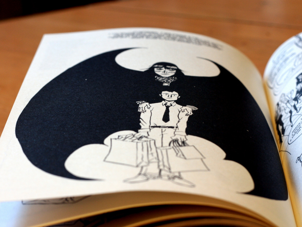
In a few fairly superficial ways it’s not unlike Not My Bag – it’s an identity story, text heavy, in heavily stylized monochrome. It’s about how a couple of impulsive decisions and a cloud of temptations lead a rather naïve protagonist down a trail of forking identity, and the quiet little revelation that eventually leads him back. Only, the protagonist in The Lengths sells his arse rather than designer sweaters, and he has the head of a dog.

The Lengths - end of issue 1

Actually, let’s get the dog thing out of the way now. This is not Disney. It is not Redwall. In places the style is scratchy and brutal and it certainly isn’t cute. Some of the dog breeds are used to quickly telegraph traits, others just to give characterful faces. They’re aggressively physical, and the human/canine disconnect emphasises that. There's two types of incongruity at work here, and they both help grab attention. One is just having dog heads on the bodies of what often look like underwear models, the other is that this isn't your kids' section talking animal story. When these dog-people play video games, or have coffee, or nosh each-other off, it can just spark a bit more attention that it otherwise might. It's a little flourish, and it's not overplayed.

It may not be overly saucy and explicit, but The Lengths is not shy about its sexuality. In places it almost has a swagger. The seasoned-escort Nelson in particular is like some kind of improbably-buff BDSM Anubis with a torso from the wrong end of a Rob Liefeld sex fantasy. Seriously. I’d love to believe he’s a joke about that Captain America cover. And again, his bull terrier head just foregrounds the aggressive physique.

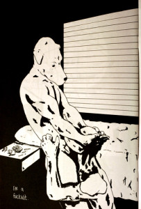
Stylistically, The Lengths is an odd one. It uses actual panels very sparingly, more commonly layering images around each-other and using a lot of whole page layouts. Text floats, and images associate spatially, often radiating around the point of the page’s focus. That focus is typically Eddie, and often his memories. The book is told through his experiences, and the world often flows around him, surrounding him with images and collapsing into panels or expanding to a page spread when it brings him up short. Visually, it’s fantastically structured.

The lengths - page 1

In fact, that's largely why I bought it. The first page kind of suckered me. The amount of character creation and tone setting it gets done with almost no words and very few lines is impressive. The world feels real, too. Chatting very briefly to Howard at Thought Bubble (he’s utterly lovely, incidentally) he spent a lot of time researching it. The story is not documentary, it’s not a broad exploration of the sex trade, for instance. But it rests on top of a series of interviews and conversations that help make it feel concrete, plausible. Likewise the relationships – the group of friends and boyfriends and casual encounters it’s spun around, they have defined, neatly-crafted tones of voice. The geeky milieu makes me think of people I know, or certainly people I've met.

It's sweet in places - it's built around a gentle, tentative love story. Getting together with Dan forces Eddie to try and reconcile his two lives. Through that stress he explores previous relationships, wrong turns, and how he ended up here at all. The ending (again, similar to Not My Bag) is self-awareness and the start of something rather than big denouement fireworks.

I picked up The Lengths for the first page, for being a bit striking and visibly well-constructed. That stays true throughout, and I'd recommend others picking it up not just for that style, but for the character work that carries through it.

Fatale Roughs Up Gender Tropes in a Dark Alley

A brief note: I’m using noir in this context to refer to both film noir and noir-ish detective novels, because otherwise it’s just an exhausting exercise in drawing ever more granular distinctions that no one bar three obsessives cares about, and it also fails to inform upon this context. Still here? Good. Let’s go. Fatale

Noir has a troubled relationship with women. Yes, its heroes are meant to be flawed. Greek legend levels of flawed. These people get stuff wrong, a lot, and I appreciate. A lot of noir is still fiercely misogynist, which is problematic, in an enjoying problematic things way. There’s plenty to love about those stories, but the general treatment of women is not one of them.

Fatale (by Ed Brubaker and Sean Philips, who together know more than most about crime fiction) takes the weary femme fatale archetype and subverts it brilliantly. Josephine, the titular character, is a femme fatale that has the role thrust upon her - a murkily-defined ritual has given her the power to manipulate men, and has left her on the run from people far scarier than the usual mobsters and hitmen (of course, these figure). She resents it, fights against it, reluctantly employs it when it’s a matter of using it or surviving. It’s not a million miles away from the usual sad, desperate and manipulative women of noir stories, but it’s that closeness when combined with the crucial differences that makes it a worthwhile comparison.

In creating a character that is aware of her own role in the story, Fatale allows Brubaker not to just use the trope in a modern setting, but also examine and deconstruct it in a dramatic setting. There’s nothing especially campy about Fatale (as there usually is with any post-modern take on noir or pulp), it's just a pulp story told in a framework that allows it to both treat the story and the genre with a certain authenticity (give or take some cosmic horror), while allowing its female lead to be a stronger and more interesting character than the form usually allows.

It’s not the first comic to attempt it. Brian Michael Bendis’ Alias places a female character in the gumshoe role (in the Marvel Universe no less), and doesn’t clean it up in any way. It strays in some ways (superpowered rape analogies, for one thing), but it's still an interesting take on the genre. Both are worth reading, but Fatale is worth picking up now. It's recently been expanded into an ongoing series, and with good reason. Beyond all the clever deconstruction, it's also just an excellent crime / horror tale.

Not My Bag

Not My Bag - Sina Grace closeup1

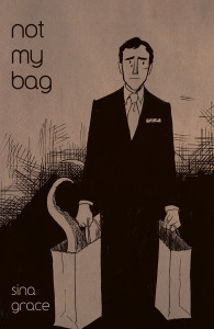
Appropriately for a book that is at least in part about the lure of luxury aesthetics, Not My Bag is a gorgeous piece of publishing deign. The endpapers are a grey marl like polished concrete, the print stock is thick, the type is clear and stylish - it's beautiful  and it should probably have been a hardback.

In it, Sina Grace (Books with Pictures,  Lil' Depressed Boy, and Cedric Hollows) recounts his days working in a department store, being sucked into its high-competition, high-fashion world, and going just slightly mad at the edges. It's not quite Sad Comics, but it's definitely black and white, slice of life, nodding to Blankets comics. That may not be a genre, but it's certainly a recognizable package of styles.

Not My Bag is personal and confessional, with Grace unafraid in places of showing us his less flattering sides. The young artist takes the job to pay the bills, and, haunted by lingering neuroses and failed relationships, slides into superficiality, occasional bitterness, and crass materialism. It ends in the only way it could end - a quiet catastrophe of imposture with Grace storming out of the store, forced to choose an identity and realizing he has chosen correctly.

Not My Bag, Sina Grace. Closeup image.

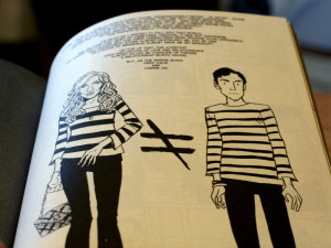
But there are some gorgeous panels and page compositions taking us through that ending. The day to day of it, the body of the story, is a joy of little observations. The haggard and fading sales shark; the new manager, masked, and sinister verging on occult; the sudden breaks in the visual flow - replacing realism with something emotionally mimetic and decomposing the arrangement of panels to pull out a little detail or foreground a powerful moment; it's good stuff. The book excels when it takes something - most often fashion - and anatomizes it, often dedicating  a full page to details, annotating, and exploring.

The retail days that make up the story are a thread of these moments and details. Character interactions will suddenly pull into meticulously sketched touchstones, amplifying the feeling of an identity built out of objects. There's a porcelain pony that represents an old love's heart in ways we are never told. There are memories rendered as photographs or letters, an office full of snow globes, tie pins, cuff links and shoes. People and places are often far less detailed than things, and the big emotional moments - panic, especially - see a vastly simplified visual style, with fewer and softer lines, more curves, more blocks of colour.

Grace's protagonist-self shows us little or nothing of him as an artist. He draws largely off stage. His love of comics is assumed rather than introduced. It's almost a shock to hear comics mentioned at all, much less see him hand one of his books to his boss. His trip to Comic Con is abstracted to a conversation on the stairs. It's sparse, gentle, and slight, where the retail conference before it is a riot of a page. Comics, art, to an extent relationships are not part of this world, and the trip precipitates his final crisis at the department store.

The effect is an incredibly tight focus - there is little outside retail, and little of the retail world outside fashion. Our gaze is tightly controlled, and we're left watching Grace reconstruct his identity around objects, and narrow his relationships to something equally transactional, commercial, and superficial. It's rough going in the middle, and you want to shake him by the shoulders a little. NotMyBagCover

The revelation then, that "none of these faces matter", can only seem a little small after all of this. He's snapping out of making some dumb mistakes, and realizing he's been chasing something profoundly artificial. It's not that deep or original, and it doesn't pretend to be. Again, the details are the powerful part. So it stops. There's a disconnect between the narrating and narrated selves, and we don't see quite how Grace gets from there to here. We see him realize he was screwing up in time to stop, and we see him learn that stopping is possible. That's pretty cool.

Not My Bag is well worth picking up. It's a fascinating exploration of the balance of show and tell, and of storytelling through objects and details. It's uncomfortable in places - there are some cringing moments of lack of self-awareness - but it is itself a beautiful little object.

iZombie

iZombie It’s pretty rare for me to read an issue from the moment it starts right through to the end (a preference for trades over single issues and a lack of time tend to mean I’m always catching up), but Chris Robeson and Mike Allred’s iZombie somehow grabbed me and I stuck with it. It’s hard to describe without making it sound like sub-Buffy nonsense, but it concerns the lives of a bunch of monsters in Eugene, Oregon. The central conceit (that Gwen, the main character, eats the brains of the dead and solves unresolved issues relating to their deaths) is abandoned early on for a more freeform structure, giving focus to the full cast of characters and paying more attention to the arc. I’ve been a sucker for Allred’s artwork since I first encountered him on X-Statix. Robeson’s plots are pacey, leave a lot of dangling threads, and introduce enough new weirdness to keep a reader hooked. Sadly, after he left DC Comics over his criticism of their treatment of writers and artists, the series had to be wrapped up in a hurry, and all those dangling plot threads were shoved into a final 7-8 issues at a pace that couldn’t really support them all. It’s a shame because while the series was never brilliant, it was always a lot of fun, and it would have been good to see it wrapped up at the pace at which it was intended. Hopefully Roberson’s experience and the recent changing of the guard won’t stop people from creating great things at DC / Vertigo.

Sad Comics Reviewed - The Carter Family: Don't Forget This Song

  The Carter Family: Don't Forget This Song

It's often said that there's something out there for everyone, and I knew from the moment I saw some of the preview pages from The Carter Family: Don't Forget This Song that it would be absolute catnip for me. Frank M. Young and David Lasky, with the help of 150 or so Kickstarter backers, have pulled off something very special. It also happens to be a perfect constellation of my interests: comics, sadness, biography and folk music, set against the somewhat dour backdrop of rural early 20th century America.

Very brief history lesson: country music as it exists today grew out of the tradition of Woody Guthrie, Bob Dylan (before he went weird), Johnny Cash and countless others of that generation and style. And pretty much all of those guys and their contemporaries were heavily influenced by the Carter Family. A.P. Carter, his wife Sara and her cousin Maybelle (mother of June Carter Cash) played music together as the Carter Family from the early 1920s to the mid 1950s, had a crowd of musically talented children between them, revived interest in hundreds of traditional songs from their native Virginia and set the stage for basically all the American country music that followed. Not bad going. I'd tell you more, but the whole story is in the book and you should definitely read it.

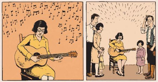
I'm approaching The Carter Family with my interest-in-sadness-and-comics rather than my interest-in-folk-music hat on, but it wouldn't be possible to review a book with so much music woven through it without spending a minute or two talking about that. As an absolutely brilliant bonus, the book comes with a CD of original Carter Family recordings. I can almost guarantee that I'm going to be listening to nothing else for the next couple of weeks. Music in The Carter Family is represented straightforwardly using words and pictures, but it's done really rather well – the feeling of having lost something by not being able to travel back through time and sit silently in the living room, recording studio or radio booth with the Carters while they sing and play is intense and palpable, but Young and Lasky's writing and art nearly makes up for the fact that no one's figured out time travel yet. I ached, as I read it, to hear the songs. The depiction of A.P. Carter and Sara Dougherty's harmony – the moment in their courtship when all her other suitors admit defeat, the couple's voices blending together in a red cloud above their heads – is one of the most perfect visual interpretations of sound that I've ever seen, and it's this skilful representation which makes something so thoroughly grounded in sound actually work on the page.

That Maybelle Carter could certainly play guitar

However, if you know or care little about music (of this period & genre or in general), there's still plenty to like about The Carter Family. As with all the best (true) stories, the narrative is strong and deeply human, infused with a lingering sadness as the Carters achieve musical and financial success but find that they're less happy than they were when they were poorer. The story can be a little jarring as it jumps forward in time, but it's a powerful enough tale that this doesn't really matter. The Carters are, at heart, good people who end up out of their depth. By the end of the book, it's still about the music, but everything else around them has changed. And in terms of the art, Lasky's linework and muted colour palette suits the Depression-era setting perfectly.

The Carter Family: Don't Forget This Song was a joy to read, and you've a real treat in store for you if you haven't picked it up yet.

Comics for Kids

Somewhere between the well-worn “comics are for kids” trope and the strident call and response of “Watchmen!”, “Dark Knight Returns!” and “They’ve got boobs and swearing now!” an important fact seems to have slipped, namely that comics really don’t seem to be for children any longer - and not in the way anyone would have hoped. For a lot of the time they’ve existed comics have largely been aimed at children. But the medium has matured and broadened, and it’s important to remember that it’s exactly that - a medium. And just like any other medium, it should be able to support as broad a range of ‘stuff’ as possible. Booker Prize nominees surely don’t feel threatened by the contents of the children’s book section of their local store, similarly comics fans should learn to appreciate that a broader range of titles is a sign of a thriving industry, not a threat to what they want to read. I digress. As the market has become more mature (older, not necessarily wiser), the bigger publishers have moved away from the all-ages fare they previously published, and started producing books that target the 25 - 35 age group that pays their bills. I was dimly aware of this, but I was reminded starkly when two friends independently asked for recommendations for comics for kids and, despite being a fairly voracious reader of comics (as was one of those asking), I struggled to come up with suggestions. There are good titles out there, but they definitely seem marginalised at the moment. Licensed comics have done OK - Boom! Studios had a broad range of Disney and Pixar titles before Marvel was bought by Disney, and The Simpsons comics have always sold steadily, but there’s definitely room on the shelves for more kid-friendly fare. After all - children are our future. We need them to grow up and pay taxes to fix our hideous future diseases, as well as buying comics to make sure we have a thriving selection of comics to read when we’re in Hideous Future Disease Hospital.

I’m looking at relatively new stuff here - reading the Beano, The Dandy (now reborn as a website rather than a physical comic), Asterix and Tintin is a given. You should be prodding your kids with a sharp stick until they read those (Disclaimer: I am not a childcare professional). So, in alphabetical order so as not to play favourites (Atomic Robo! Atomic Robo!), here is a by no means exhaustive list of recent comics for kids and teenagers.

All-Star Superman

Grant Morrison (Writer) and Frank Quitely (Artist)

All Star SupermanMaybe one for the slightly older kids. Grant Morrison tells a standalone Superman story that may well be the definitive take on the character, blending mythology with a 50s-style forward-looking, ultimately optimistic sci fi tale. Modeled after the 12 tasks of Hercules, it takes Superman back to the roots of the character before he got bogged down in 70 years of continuity, as a renaissance man, embodying many goods. It’s so gloriously uncynical that it’s worth reading just for that, but it’s also an excellent book in its own right.

Atomic Robo

Brian Clevinger (Writer) and Scott Wegener (Artist)

Atomic Robo

Nikola Tesla built a robot assistant. 100 years later, having battled the forces of wrong science across the 20th Century, Atomic Robo leads a team of ‘Action Scientists’ against ambulatory pyramids, Nazi cyborgs, and all sorts of dubious sorts. His Wile E. Coyote-alike sometime nemesis is Doctor Dinosaur, some sort of time-travelling imbecile. Incredibly funny, well-written, and featuring top-notch cartoony artwork, Atomic Robo is the comics equivalent of a Pixar movie. It works for kids and adults equally well, with some jokes that will go straight over kids’ heads (unless they know a lot more about H.P. Lovecraft’s racist tendencies than I did at that age).

doctor_dinosaur

Atomic Robo is much easier to get digitally than it is physically, but let’s face it, you’ve got a tablet. In the last few years tablets have replaced fire (0 -1900) and crushing poverty (1901 - present) as the premium junior-distraction during mummy and daddy’s special gin time. Comixology has it all for very little cash. If you do want to get physical copies, there’s no pressing need to read them in order. The series jumps around in time, so each trade is a self-contained story that doesn’t require knowledge of the others to get onboard. If you want a taster, the Free Comic Book Day editions are available on Comixology for no cash.

Bandette

Paul Tobin (Writer) and Colleen Coover (Artist)

bandette

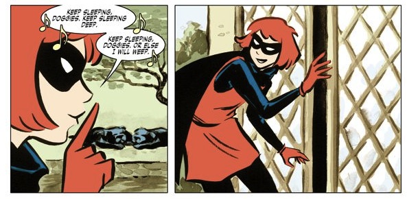
Bandette is glorious wish-fulfillment stuff for kids. A young sneakthief in a non-specific Franco-Belgian city (it has elements of Paris, but is also decidedly Not Paris) constantly outsmarts the adults around her and is often the only person the police can turn to to solve other, worse crimes. It’s fast-paced and beautifully illustrated, with both art and writing drawing from European kids comics (although you sometimes get the sense it’s being written for a young Audrey Hepburn).

It’s part of Chris Robeson and Allison Baker’s Monkeybrain Comics line, which is digital-only at the moment (via Comixology). They’re listing it as 15+, which seems incredibly conservative. Younger children should have no trouble with this. As with other Monkeybrain titles, it’s 69p / 99 cents an issue, so there are no excuses not to try it.

Mouseguard

David Peterson (Writer and Artist)

Mouseguard

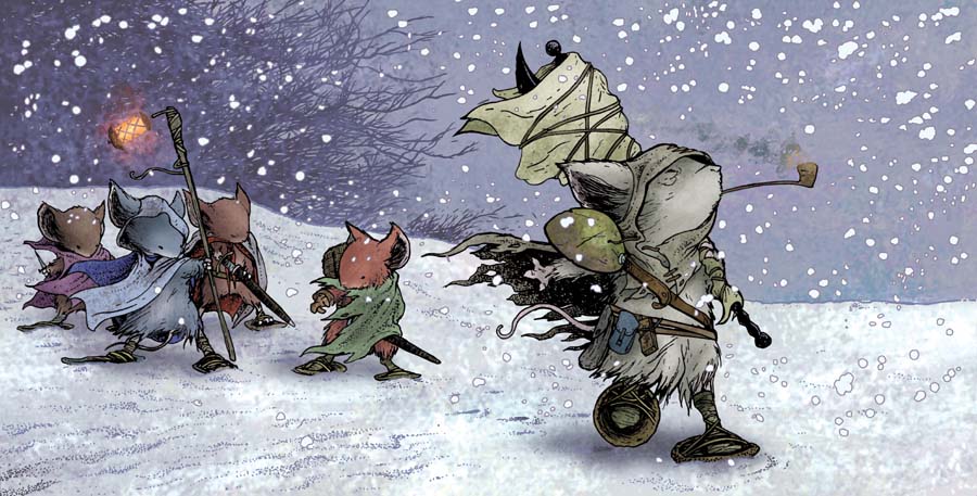
First things first - there are talking mice with swords, so yes - it is a bit like Brian Jacques’ Redwall series in that regard. Mouseguard is set at a very different scale though, with the tales being small and character-driven, rather than the Tolkien-esque high fantasy of Jacques’ stories. The artwork is the main draw though, with precise linework and watercolour-esque colouring that makes Mouseguard look like nothing else on the shelves.

New Brighton Archaeological Society

Mark Andrew Smith (Writer) and Matthew Weldon (Artist)

New Brighton Archaeological Society

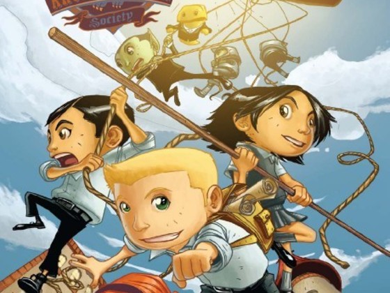
More wish-fulfillment stuff. Here a gang of kids take up their parents’ mantles as the New Brighton Archaeological Society, and head off on an adventure with goblins to find out what happened to their parents. It’s slightly knowing, but has plenty of humour and faintly unthreatening adventure aimed at kids. There are dead parents involved, and the possibility of some villainous relatives, but it never strays into particularly dark territory.

You can read the first volume online - a second volume was funded last year and is currently being finished up. There’s a trade paperback of the first volume available as well.

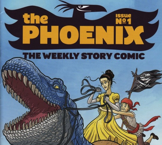
The Phoenix

Various writers and artists

The Cover of The Phoenix Comic Issue 1

This new British comic only launched properly in 2012, but it’s already starting to pick up a fairly sizable audience. There are strips from well-known indie comics creators like Simone Lia and Paul Duffield, as well as a range of up and coming artists. It rotates new stories in amongst recurring strips, so there’s a lot to see. One highlight is Adam Murphy’s Corpse Talk strip, where the author digs up historical figures and interviews them. Just macabre enough for kids.

There’s a fairly content-light website here, but you’ll need to pick up a physical copy to see much of the strips (a bold idea!). There’s a map of bookshops that stock it on the site, and it’s also available from Waitrose supermarkets. No further comment on that.

That’s all folks

There’s always more that I could recommend, but I’d encourage anyone who reads comics with their kids to chime in and let us know what they’re reading at the minute. There seem to be so many good writers and artists working in kids’ comics at the moment that it would be a shame to see their work continue to be pushed off shelves to make space for recycled ideas.

Sad Comics Reviewed: Ellerbisms

I finished Marc Ellerby's Ellerbisms over the weekend. It was both a quick read and a good one. What with the nice colouring on the cover (yep, I judge books by their covers too) and with Marc Ellerby being such a genial chap when I met him for all of thirty seconds at this year's Thought Bubble, I didn't immediately peg Ellerbisms as sad comics. From the blurb on the back of the printed edition* - "A relationship told in pictures through the autobiographical comics of Marc Ellerby, Ellerbisms catches a glimpse into the life of a young couple, their highs and lows, their sighs and lols." - it could have gone either way. And there's a lot of light-hearted stuff to be found in the pages of Ellerbisms. Plenty of the strips are about two young people geeking out over stuff and being in love. It's very sweet and very funny in many places. In others, it's pretty desperately sad. And, every now and then, it goes to some really rather dark places. As much as it's about a couple of kids in love, it's also about a young guy trying to process some difficult experiences, and the fact that Ellerbisms is autobiographical means that that processing feels truer and rawer, perhaps, than if the same themes had been presented behind the veil of fiction.

The fact that they're daily diary snapshots ("The idea of Ellerbisms originally was to take a moment of the day, no matter how trivial and small it seemed, and illustrate it as a comic in a Moleskine sketchbook"**), and not just autobiographical comics, has some pretty interesting ramifications in terms of the overall narrative. Ellerby is fairly upfront about the fact that he used the collation of a series of strips which were originally webcomics into a printed book as an opportunity to give the narrative more shape, but it's still fragmented - much more so than anything with a more traditional narrative style - and the prologue and epilogue which were added to round out the story for the print edition share this fragmentation rather than easing it.

The strips are small scenes from a greater life, the details of which we as readers are not totally privy to. We're left to fill in the gaps - both literally and emotionally - between the events Ellerby depicts, and this process of constantly playing catchup within the shifting scenes of two people's relationship is both fascinating and exhausting. Ellerbisms drags the reader through a series of emotional cruxes (often the things which naturally would have stood out on any given day - it's not a surprise that this is the stuff he picked to draw) with minimal explanation or editorialising. And it's this, I think, which gives Ellerbisms a lot of its rawness and power as a story and as a book.

It's not all dark, and there are plenty of cameos and in-jokes for anyone even fleetingly familiar with the UK (and occasionally transatlantic) comics scene - my favourite being "Jamie McKelvie appears courtesy of Kieron Gillen" - but Ellerbisms is, at its heart, a comic about love and loss. They're very human themes, and Ellerby handles them tenderly and largely without comment, which is adds to the emotional potency of his treatment.

It's a charming, sweet and funny book, the art is lovely and I thoroughly recommend it - but Ellerbisms is definitely sad comics.

* I'm aware that this tactic is the blog review equivalent of opening an essay or presentation on any given topic with the dictionary definition of that topic, but bear with me here.

** Marc Ellerby himself, in the introduction to the print version

Just what is ConSequential?

We've had a website live for a week or so. We’ve written about Hawkeye and Sad Comics. But we haven’t really explained what ConSequential actually is, or why. On the homepage, we’re describing it as “A slightly different comics event”. Hopefully, this isn't too smug. It is also sufficiently vague that we couldn't really be held to account if we just threw in our hats and threw a Tintin-themed tantric yoga tea party.

ConSequential - thinking about comics

So what is it?

Well, it’s very much a work in progress. But it’s a comics con that's seeking to borrow the vibe from pop-theoretical conferences. Think TED for comics. Or maybe something a bit more like the awesome Playful. Imagine Thought Bubble if the speaker sessions and panels at the con were front and centre. It's something smart, thoughtful, maybe a little bit daft, and all about comics.

We actually had the idea at Thought Bubble, or – more accurately – at a pub afterwards.

We loved Thought Bubble. We enjoyed Kieron Gillen’s session on creativity, and the opening panel on what’s been awesome this year, and we loved the Women In Comics panel towards the end. (and what a line-up – Alison Bechdel, Kate Beaton, Simone Lia, Hannah Berry, Fiona Stephenson). But we want more.

How neat would it be, we asked ourselves, to have spent the whole day listening to these awesome people talking about what they think about comics? How cool would it be to get those perspectives on comics criticism, or cultural theory, or historical contexts, or the creative process, or damn, I don’t know, whatever they want to shake out of their funky-smart-weird brains for most of an hour.

So that’s what ConSequential wants to be – the accessibly-academic, pop-theoretical, half con, half conference comics event.

Great, whatever. Be more specific

So far, we're thinking about a single day event, single stream, built around speaker presentations. We're not sure if we'll do panels or a public call for papers, but if you've got something you'd like to talk about, tell us.

Location and time are still up in the air, but if you were thinking London, probably some time in late 2013, then I wouldn't bet against you. The following spring, as well as Bristol, Brighton, and maybe Cambridge aren't being ruled out either.

Do you fancy it?

No, really though, do you? We’re just starting out, and if you think this sounds like something you’d want to go to, or something you’d gleefully gnaw off a leg to avoid, or if you’ve been to one and it rocked or sucked, we really want to hear about it. What would you want at ConSequential? Who would you want to hear, and what would you like them to talk about? Tell us things so we can try and build something awesome. Go on.

You can leave a comment, or grab us on Twitter, or Facebook, or by email

Why Sad Comics?

Let's talk comics. Sad comics, specifically. After all, comics aren't just for kids any more, and I'm very interested in the darker side of things. This isn't much of a surprise – I started out as a strange, morbid child reading 19th century children's novels (the kind where someone dies of scarlet fever or typhus once every twenty pages or so), graduating onto Will Self and Don DeLillo and all kinds of disturbing postmodern shit by my early teens. Not to mention a meandering detour through the sad lady novelists of the last fifty or so years, from The Bell Jar and Girl, Interrupted through to Prozac Nation. I prefer my melancholy anatomised and my demons noonday. The sad comics were waiting for me, and I was waiting for them. But there were obstacles standing between us. Mostly the fact that I'd spent those dour teenage years modelling myself as a serious student of literature, and then went straight from that youthful posturing to fancying around in a ludicrous neoclassical enclave. I meant serious business, and comics were not serious business. Oh, sure, I took the odd foray here and there. I delved into the Sandman series in my second year, smugly appreciating the Shakespeare-y bit, and someone forced Watchmen into my hands about six months before the film came out. I liked both comics a great deal, but had no idea there was more (equally good, much sadder) stuff out there. I had no one to curate my first tentative steps into the world of comics, and no real idea where to begin.

Fortunately, all of that changed at the beginning of 2011. A dear friend gave me a copy of Fun Home, and it legitimately changed my life. Fun Home was my road to Damascus. The scales fell from my eyes. Until that moment, I'd had no idea that comics could be so good. Or so sad. It became my litmus test – my Bechdel test, almost, if that weren't already something awesome – and I spent the rest of the year trying desperately to find something sequential that pushed every single one of my buttons in the same way. It took a lot longer than it should have to properly plug into the specific kinds of comics that happen to get me going, which is mostly the reason I want to write up some reviews and do a bit more exploration of the subgenre: so that today's sad kids can find more of the good stuff and less of the less good stuff*, and more quickly.

Since then, I've been very lucky in finding comics which hammer on my sad, sad buttons like nothing else. Stuff which lights up every miserable neuron the way Fun Home did when I first tore through it in the space of an afternoon, gasping at every crisp, unhappy turn. And I want to share them with the world – few are as well-known as Bechdel's recent work, but many are just as good.

After all, misery loves company. So join me. Let's dive into the slough of despond.

*There are plenty of comics out there which look or sound, on cursory inspection, like sad comics. And yet they are not. It's a dangerous liminal space, and I'd like to guide as many miserable children through it safely as I can.

All the Hawkeye That's Fit to Print

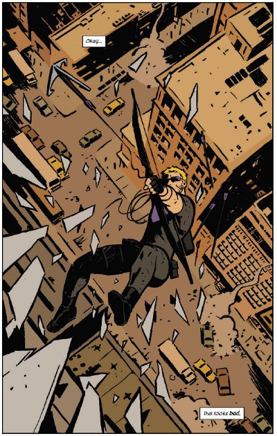
Okay... This looks bad

Okay... This Looks Bad.

A little-loved character, popularity buoyed by a recent highly-succesful film, suddenly granted his own series when traditionally he’s never engendered either sales or acclaim - it sounds like the absolute worst sort of cash-in. The signs to the contrary were there already  though - Marvel could have taken advantage of the huge popularity of Tom Hiddlestone’s take on Loki after Thor and The Avengers, but instead Kieron Gillen was allowed to do something far more interesting with the character in Journey into Mystery - something that doesn’t resemble the cinematic Loki in the slightest.

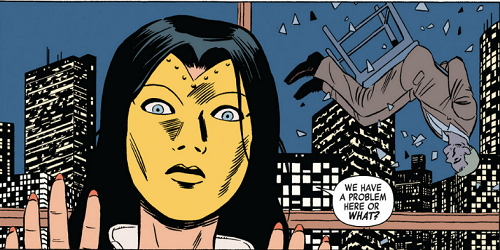
Hawkeye This Looks Bad

Hawkeye’s the same. Rather than go with something resembling Jeremy Renner’s pouting, dubiously-capable take on the character, Matt Fraction (writer), David Aja (main artist) and Matt Hollingsworth (colourist - an awesome one) are free to craft a freewheeling comic action caper that draws more on cop shows than on superhero comics for its tone.

And it works so well. So incredibly well.

There are two Hawkeyes now. Superheroes have an appalling capacity for death and resurrection, and during one of Clint’s periods of extended expiration the young, rich Kate Bishop took up the mantle. This new series sees them (both still called Hawkeye) working together as a dysfunctional team, Clint the older more experienced character who is still far, far too feckless to be an effective mentor, Kate someone who won’t make his life an easier if she can help it. This unexpected central dynamic is key to the book working so well. Clint is someone who tries to do the right thing no matter how outclassed and out-matched he is, doubly so when someone’s watching.

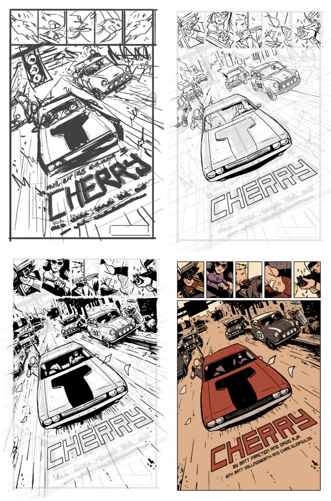
David Aja’s art looks simplistic at first glance, but behind the simple lines and Matt Hollingsworth’s minimalist colouring is a fantastic understanding of anatomy and motion. Here’s a look at a single page from thumbnail to final, coloured version.

Hawkeye Page Process

Aja’s the main artist on the series, but some issues are being handled by others, like Javier Pulido on issues 4 - 5. Fill-in artists are rarely thought of kindly, especially popping up in the middle of an acclaimed run, but Pulido is an effective replacement for Aja, and the fact that he’s been used for a standalone mini-arc seems like a excellent use of a second artist when you need to keep a book on a monthly schedule.

The covers are as good as anything on the shelves right now - heavily stylised, minimally coloured, incredibly striking. They also reflect the colours in the book. Red has started to creep into the minimalist palette as of issue three, and the second volume - read “trade paperback” - has shifted from purple to red as its main defining colour. It’s a small thing, but it’s the sort of detail that makes Hawkeye both coherent and fun.

Hawkeye Covers 1- 8

Basically, buy this comic. Even if you don’t like superhero stuff, buy this comic. I don’t even buy single issues, and I buy this comic. It’s fun, it’s smart, it’s made by people who clearly love and care about what they’re doing. In a time when almost all coverage of the big publishers is negative, it’s just great to see people doing good work and clearly enjoying doing it.

The Hawkeye Initiative

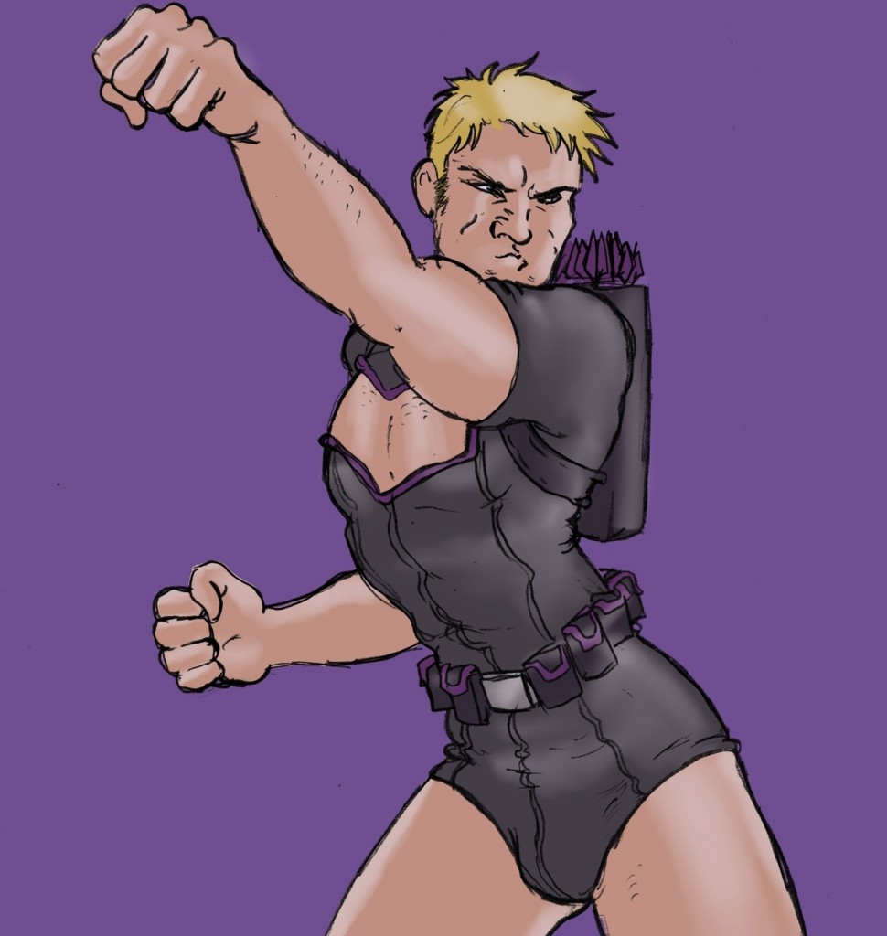
I shouldn’t mention Hawkeye without talking about his other bold reinvention - that as a tireless pointer-out of sexism in comics. The Hawkeye Initiative takes the worst, most spine-bending, ludicrously sexualised images of women in comics and replaces them with... well, Hawkeye. The results are as funny and unsettling as you’d expect. Despite broad coverage, it doesn’t seem to have triggered the usual ultradefensive reaction from those fans that feel any criticism of the comics field is a personal attack. Or worse, those that genuinely don’t recognise that this problem exists. There are the odd one or two people who don’t get it, of course, but they’re always there.

It’s good to see that the unlikeliest Avenger can be a force for good in the real world too.