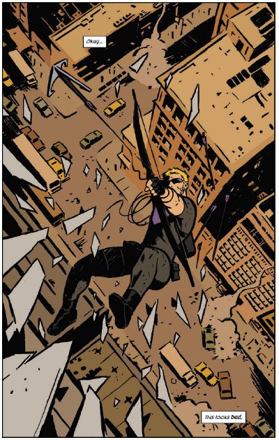
Okay... This Looks Bad.
A little-loved character, popularity buoyed by a recent highly-succesful film, suddenly granted his own series when traditionally he’s never engendered either sales or acclaim - it sounds like the absolute worst sort of cash-in. The signs to the contrary were there already though - Marvel could have taken advantage of the huge popularity of Tom Hiddlestone’s take on Loki after Thor and The Avengers, but instead Kieron Gillen was allowed to do something far more interesting with the character in Journey into Mystery - something that doesn’t resemble the cinematic Loki in the slightest.

Hawkeye’s the same. Rather than go with something resembling Jeremy Renner’s pouting, dubiously-capable take on the character, Matt Fraction (writer), David Aja (main artist) and Matt Hollingsworth (colourist - an awesome one) are free to craft a freewheeling comic action caper that draws more on cop shows than on superhero comics for its tone.
And it works so well. So incredibly well.
There are two Hawkeyes now. Superheroes have an appalling capacity for death and resurrection, and during one of Clint’s periods of extended expiration the young, rich Kate Bishop took up the mantle. This new series sees them (both still called Hawkeye) working together as a dysfunctional team, Clint the older more experienced character who is still far, far too feckless to be an effective mentor, Kate someone who won’t make his life an easier if she can help it. This unexpected central dynamic is key to the book working so well. Clint is someone who tries to do the right thing no matter how outclassed and out-matched he is, doubly so when someone’s watching.

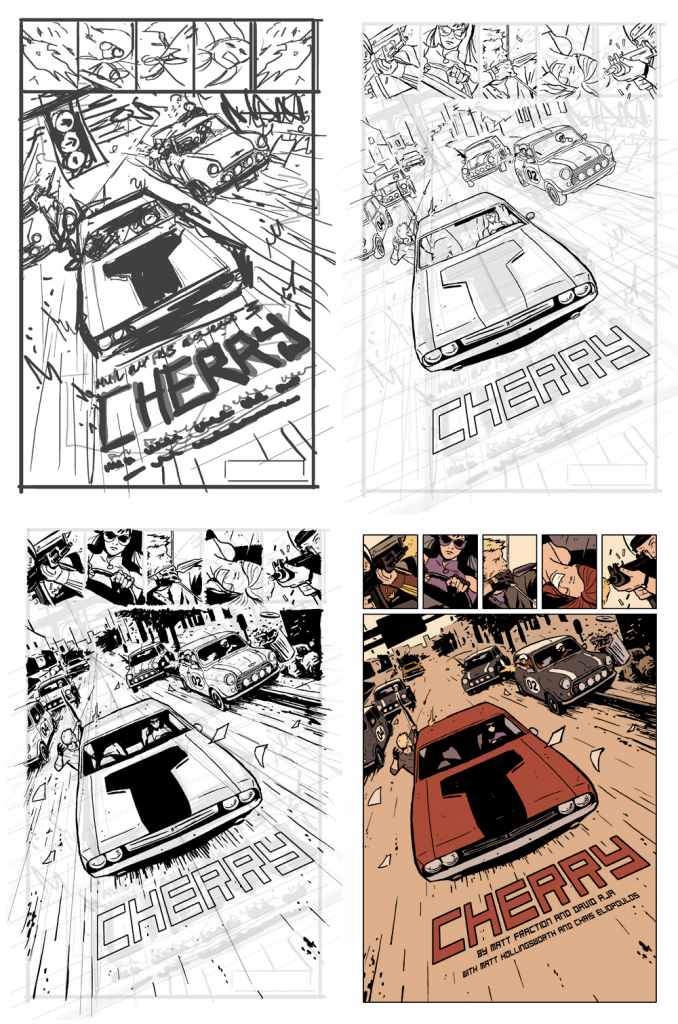
David Aja’s art looks simplistic at first glance, but behind the simple lines and Matt Hollingsworth’s minimalist colouring is a fantastic understanding of anatomy and motion. Here’s a look at a single page from thumbnail to final, coloured version.

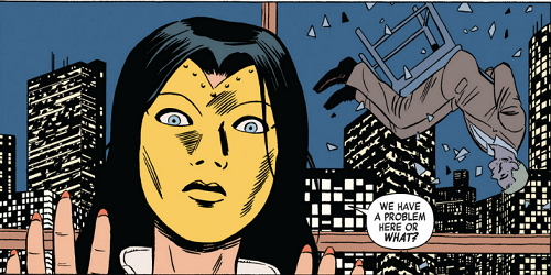
Aja’s the main artist on the series, but some issues are being handled by others, like Javier Pulido on issues 4 - 5. Fill-in artists are rarely thought of kindly, especially popping up in the middle of an acclaimed run, but Pulido is an effective replacement for Aja, and the fact that he’s been used for a standalone mini-arc seems like a excellent use of a second artist when you need to keep a book on a monthly schedule.
The covers are as good as anything on the shelves right now - heavily stylised, minimally coloured, incredibly striking. They also reflect the colours in the book. Red has started to creep into the minimalist palette as of issue three, and the second volume - read “trade paperback” - has shifted from purple to red as its main defining colour. It’s a small thing, but it’s the sort of detail that makes Hawkeye both coherent and fun.

Basically, buy this comic. Even if you don’t like superhero stuff, buy this comic. I don’t even buy single issues, and I buy this comic. It’s fun, it’s smart, it’s made by people who clearly love and care about what they’re doing. In a time when almost all coverage of the big publishers is negative, it’s just great to see people doing good work and clearly enjoying doing it.
The Hawkeye Initiative
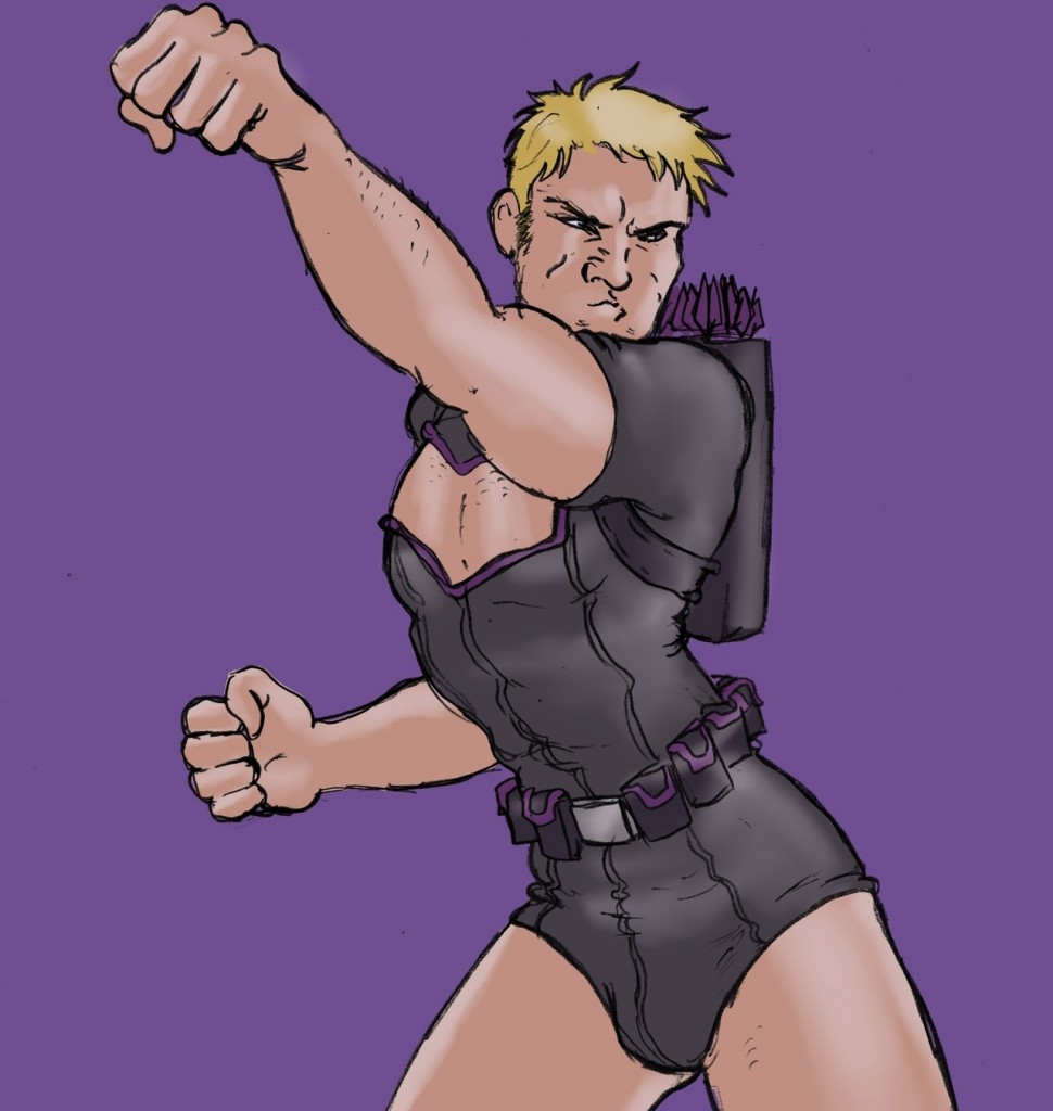
 I shouldn’t mention Hawkeye without talking about his other bold reinvention - that as a tireless pointer-out of sexism in comics. The Hawkeye Initiative takes the worst, most spine-bending, ludicrously sexualised images of women in comics and replaces them with... well, Hawkeye. The results are as funny and unsettling as you’d expect. Despite broad coverage, it doesn’t seem to have triggered the usual ultradefensive reaction from those fans that feel any criticism of the comics field is a personal attack. Or worse, those that genuinely don’t recognise that this problem exists. There are the odd one or two people who don’t get it, of course, but they’re always there.
It’s good to see that the unlikeliest Avenger can be a force for good in the real world too.


