Uzumaki (collected edition) - Junji Ito

Uzumaki (spiral) was on our reading list for the horror comics podcast, and for a putative future edition on Manga. It's a collection of short but connected horror stories by Junji Ito, centring on the town of Kurouzu-cho, which has been "contaminated with spirals". Uzumaki - cover

It's been available in English, on and off, since 2001, and I remember leafing through the early Viz Media editions back when I was shifting comics and manga for a loose approximation of a living. The 2013 "3-in-1 Deluxe Edition" collects all the stories for the first time, and is a genuinely handsome piece of publishing.

That cover and binding are where the nice things about Uzumaki start and stop. This is a creepingly unpleasant book - a taut and unsettling one-volume lesson in how comparatively simple words and pictures can be deployed to make you want to sleep with the lights on.

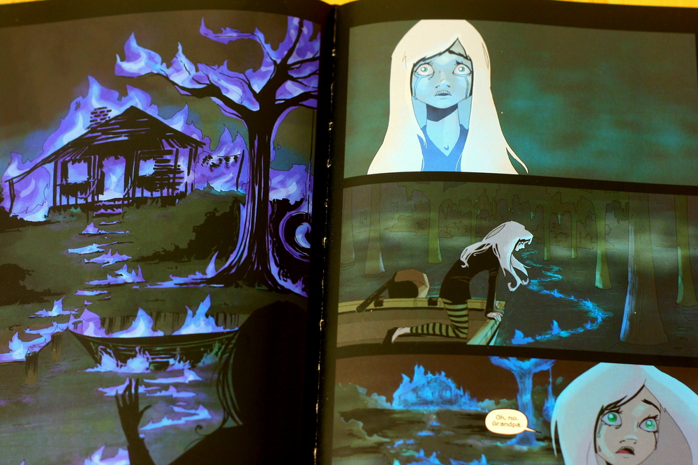
Uzumaki is seen largely through the eyes of Kirie Goshima and Shuichi Saito, a kind of schoolgirl everyman, and her increasingly reclusive boyfriend. They see the spiral infestation wind its way through Kurouzu-cho, consuming and distorting their friends, families, and eventually the entire town.

It's a quiet thing as it starts, and Kirie's gentle, almost wide-eyed observation makes the reading experience oddly immediate. Indeed, the gentler first two chapters that introduce her and Shuichi are some of the most effective. It begins with the uncanny in a fraught suburbia, coiling through body horror, the supernatural, and gradually unwinding to something of a far larger scope as the book progresses. At its liveliest, it's caper-like, intriguing rather than frightening, as though Haruki Murakami found himself drafted in to write episodes of Round the Twist. At its gentlest, you're afraid to turn the page.

Uzumaki - earsThe first story begins by making Kurouzu-cho gently oppressive. The opening pages are simple, with Kirie telling us about her school, and encountering a small whirlwind on the way to meet Shuichi from the station. She finds Shuichi's father staring, entranced by a spiralling snail shell, the single-panel view of it drawn more vividly and in tighter detail than any other so far. It's an odd interlude that establishes the motif, and unnerves just slightly.

All the while,  Kurouzu-cho presses down. The shading for the sky seems low and close, and the sea around it too dense. Shuichi points to this explicitly as he explains his growing unease in the town. All the while, Kirie maintains her light, almost naive narrative voice. It has that "and then this happened" note of childish, unaffected description. We're reading the "what I did on my holidays" piece from a horror movie suburbia.

That quality of unselfconsciously introducing the next thing that happened lets Uzumski sneak the gently creepy (and downright horrible) under our noses without much cue that it's coming. Shuichi's father, for instance, becomes increasingly erratic. It's described mildly, in conversation and glimpses, concerning rather than frightening - the old man is clearly becoming odd and detached.

Then we turn the page.

Jump scares are tricky in comics; you can't control reading behaviour, after all. But well-deployed full-page surprises can work, and Uzumaki uses them sparingly to great effect. The first isn't really a scare, but it prefigures this story's grotesque climax. It's just Shuichi's father in his study, surrounded by his collection of spiral objects.

But it's such a break from the panel flow. The borders are thicker, the detail, like the snail shell, is rendered more meticulously, and it introduces the aggressive crosshatching that gives Uzumaki so much of its atmosphere. At its most severe, the clean outline is replaced entirely by dense, curved hatching that builds shapes and figures from itchy layers of semicircles.

Uzumaki - Suichi's fatherThe first time it's used for a character is also the first hint of anything fully supernatural in  Kurouzu-cho, and next to the previous pages' relatively Manga-conventional, simply lined character design, it's a shock.

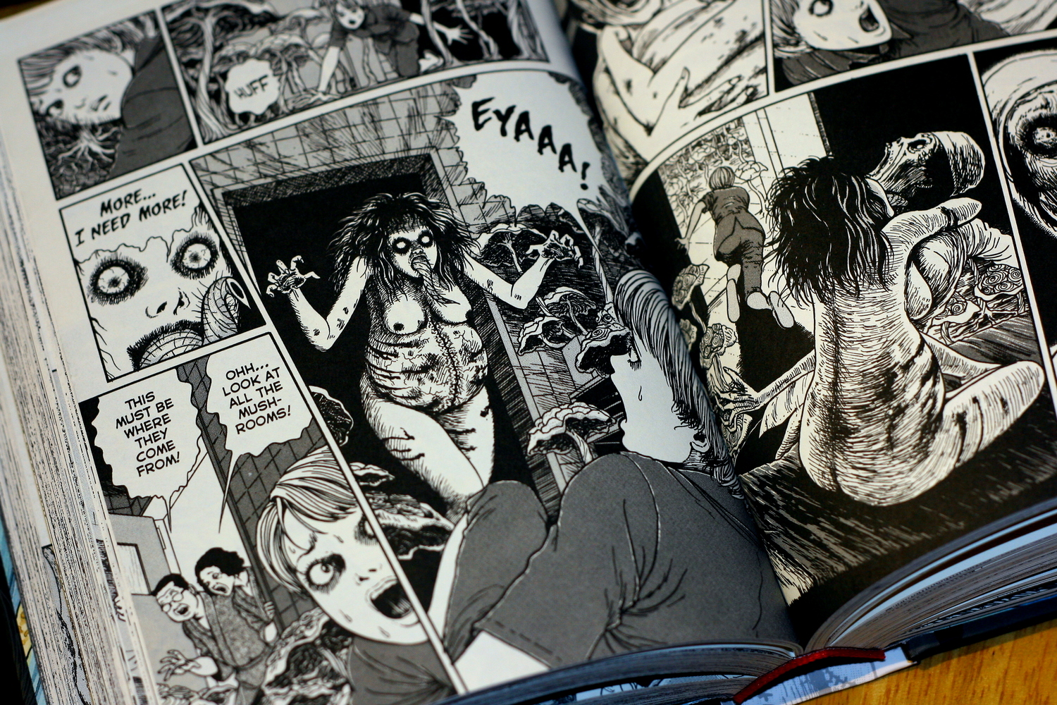
The pure density of the pen strokes makes Shuichi's father somehow monstrous, and the close focus on his eyeballs, as he rotates them in a spiral, is unpleasantly physically intimate.

In a few pages time, his spiral obsession has distorted him physically. Almost choking, he unfurls a huge, grotesque, tongue, coiled into a spiral. The dense hatching draws in again, and the focus is tight on his face. Looking away is not an option.

Then this:

Uzumaki - Suichi's father

It's not nice.

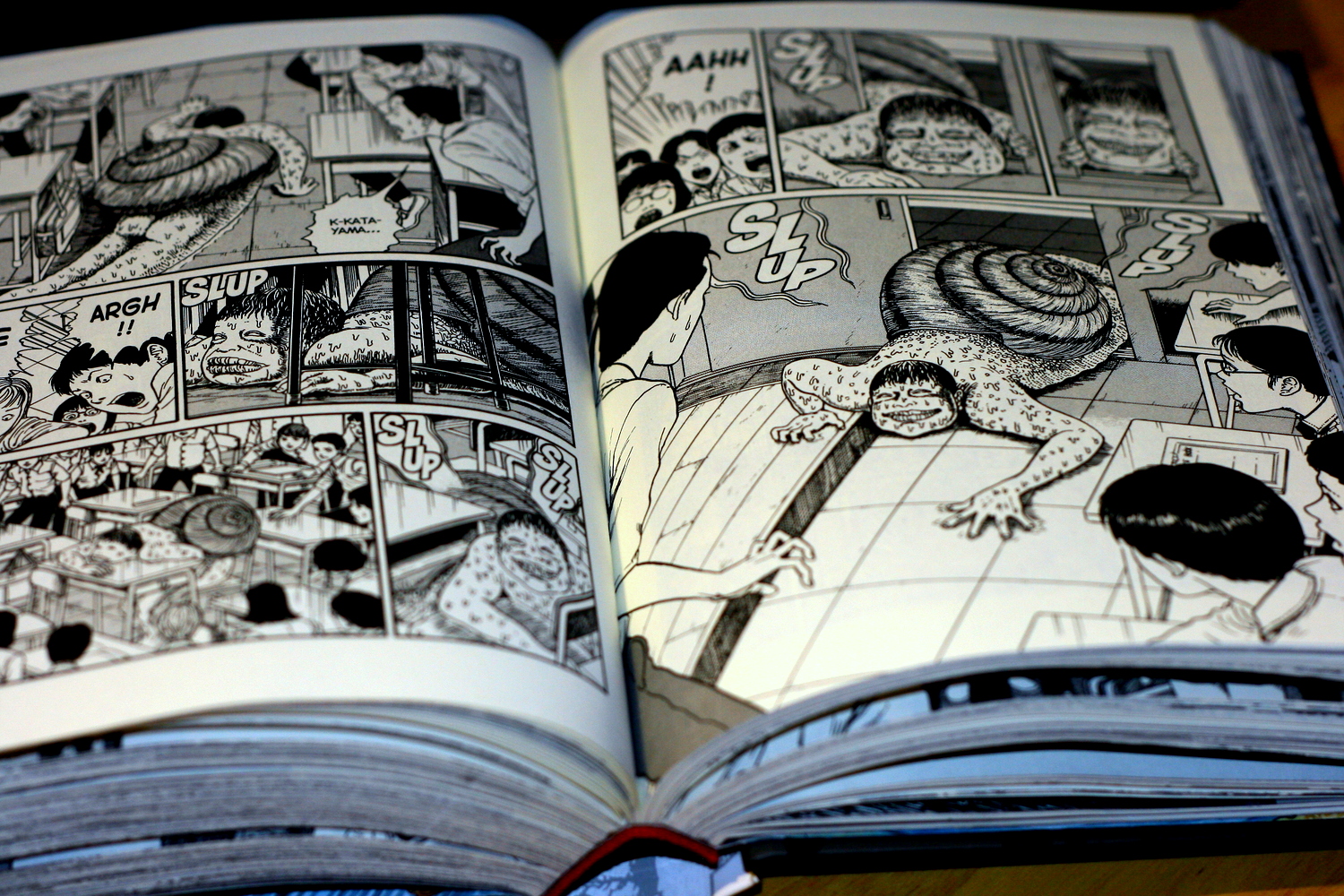
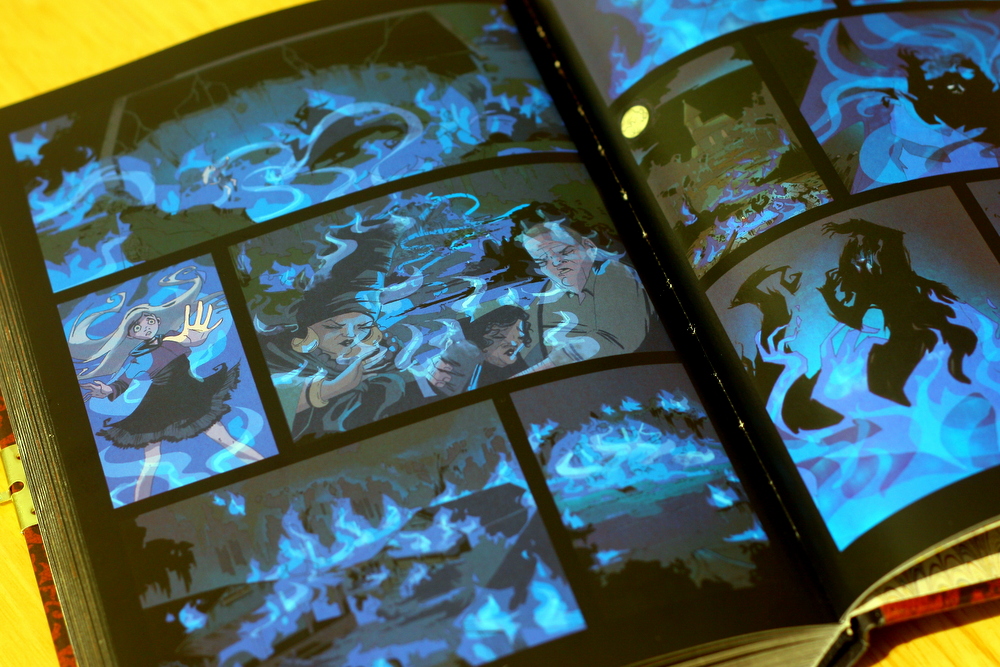
It continues not to be nice. In later stories, school children slowly turn into snails, a girl's hair forms spiral shapes and takes on a life of its own. A boy given to jumping out and surprising people is killed in a car crash, and the suspension spring reanimates his body. It would be daft if the visual intensity didn't carry it, and if Kirie weren't narrating.

Her tone, and the casual acceptance of the townspeople that the weird is ambient are what really sell the uncanny. An enclosure is hastily built in the school grounds for the transformed snail children, for instance, and the residents of Kurouzu-cho take the eventual destruction of the town remarkably in their stride. The extremes ruffle their feathers, but are quickly forgotten in place of little sketches of mundane life amid the horror, and later debris.

Uzumaki - babiesSo when - in perhaps the most disturbing story - strange mosquito parasites possess patients at a maternity ward, driving expectant mothers to stalk the hospital halls, harvesting blood with hand drills, part of the horror is how calmly it's shrugged off. They attack at night, leaving nurses mystified in the morning. Only Kirie seems to notice. Matter of fact, Kirie ends the tale with: "I've no idea what happened there after that. I wasn't about to go back and find out."

When Kurouzu-cho itself assumes a final spiral form, its residents congealed into a homogeneous twist of just-aware flesh, the moment has this same almost nonchalance of tone. Ito sets an adventure mystery in the ruins. There's a kind of sleight of hand to around the body horror. It's a feint, and the scares come from the increasingly erratic behaviour of the outsiders who have become trapped there. The fervor one of them brings to describing his desire to eat the snail children raw is as unsettling as the doctor in the maternity ward, as he stitches the parasite mushroom child back into its cadaver-mother.

I wish I were making that up.

Uzumaki - snailsI'm not. Uzumaki gets weird fast and stays there. Although its strongest theme is distortion into the spiral (of body, of community, of sanity) it employs a range of techniques to unsettle. Bodily distortion is perhaps the most common theme, and the sheer lack of distortion around these intense squeals of the grotesque is its contrast medium. The townsfolk look on, Kirie describes in her flat, accepting tone, something unfathomable happens, and life continues. Why don't they run? Why aren't they screaming? At risk of mild fatuousness: why don't I close the book?

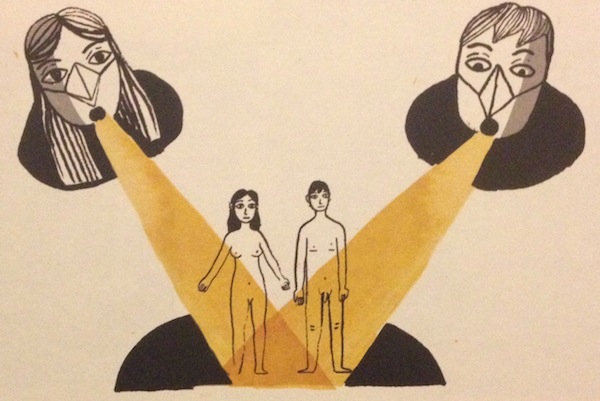
In the end, they can't. As the spiral structure is completed, it drags not just the geography of the town, but the flow of time around its whirlpool. At the centre of the spiral, after we've been given few answers, time stands still. This lap of the cycle is completed when Kirie and Suichi join hands, their bodies twisting together, in the spiral cavern beneath the dragonfly pond.

Uzumaki teases us a little at the end. It evades answers neatly - after all, what explanation could be satisfactory for what we've seen? In the end, the only thing that can tie any of it together is the distorting pull of the spiral.

Should you buy it? Probably, for all that it's a genuinely uncomfortable read. There's some nightmare fuel in the mix there, for sure, and since part of what makes it so interesting is the breadth of techniques it uses to unsettle, you may not get away lightly.

Podcast Episode 15 - Myth (Part One)

Comics, and in particular superhero comics, have always drawn on, incorporated, reinterpreted and created myth. We look at a few mythic-themed comics, as well as a roundup of some recent releases.

This week we discussed:

We also prattled on about:

Will O' the Wisp - Tom Hammock & Megan Hutchinson

Will O' the Wisp is the tale of Aurora Grimeon, a recently-orphaned girl sent to live in a swamp. It's a Southern Gothic occult mystery, and a fine one. Will 'O the Wisp

Aurora's parents die suddenly. They made pasta sauce with poisonous mushrooms, and the narrative takes a Roald Dahl-ish relish in this piece of high grotesque adult folly. After being callously handed through a similarly gleeful macabre sketch of child protection services, Aurora is packed off to Ossuary Isle to live with her grandfather Silver in a swamp thick with gravestones and Hoodoo folklore.

If you're not hooked already, I'm worried about you.

My partner picked out Will O' the Wisp from a display table at Dave's Comics in Brighton,where it caught his eye by being a genuinely gorgeous piece of publishing design. It's a neat little hardback with a diary clasp, a high quality finish, and these beautiful marbled endpapers.

You can see a few of the early pages on Comics Alliance, which is enough to give you a feel for the style, and the article calls out some of the cultural touchstones. There's Gaiman, and Burton, and  world of spooky synthetic folklore in the mix. Locke and Key, as they say, has some significant narrative and tonal similarities, although both are drawing from a wide pool of tropes. There are echoes of some of the short stories in Hellboy, too. The Baba Yaga stuff that starts in Wake the Devil, perhaps, although I don't have a copy to hand.

Will 'O the WispBut I also think there's more than a little Lemony Snicket, and from Gaiman in particular, that feeling of childhood's relation to the adult world that a friend of mine described as something like "living in a land under an occupying force whose rules you can't quite understand". There's a whole thesis on children's literature there that I've not read enough to unpack, but it resonates massively, particularly with something like The Ocean at the End of the Laneor early Harry Potter, I guess.

In Aurora's world, those rules are a blend of the intractable adult mores that she can only somewhat scratch at, and the practical rules of Hoodoo that influence the life of the isle.

The Hoodoo tradition in the book ranges from casual custom to full-blooded religion. Silver observes details, in part to fit in. From time to time he'll correct wearily with scientific detail, but his heart isn't in sneering. This fits rather neatly with his early description as "the nicest sinister man I ever met". Others take the Hoodoo details as simple factual truth. There are things you must do and not do, there is bad luck to be risked, and the dead to anger. Mama Nonnie, the "local Hoodoo woman" introduces Aurora to the tradition more fully, and as they become friends, Aurora comes to occupy a kind of empirical/mystical middle ground. It's reasonably standard child protagonist stuff that her disruptive enquiring streak and cavalier attitude to received boundaries lets her investigate the mystery of the piece. But to do so she combines Mama Nonnie's wisdom with Silver's gentleman-scientist arcana, and the more workaday Hoodoo and swamp folklore of the people she befriends.

Will 'O the WispPausing to be critical, we might suggest that structurally this is the story of a little privileged urban white girl learning and appropriating African-American folk spirituality to eventually triumph and save a comically backward rural community. That reading is available, but I'd argue it's a stretch. Will O' the Wisp's Hoodoo trappings are sketched out as pretty inclusive. I just can't see it in the tone, either, and Aurora's experience of both Hoodoo and the life of the isle are far more participatory and warm. You could also argue that the book's message is that not heeding your elders and religion will get you killed, but I don't quite buy that either. Ultimately, if anything - if - she is assimilated by the swamp, synthesising its magic and her grandfather's rather arcane "science" into something that gives her more belonging and understanding than before.

Ossuary Isle  is exactly what the name implies, and Aurora's story is of exploring it, mythically and geographically. Doing so, she is fascinated by the will o' the wisps that burn around it. Physically, these are pockets of marsh gas that have caught light. Mythically, they are little pieces of hell, carried with him by a man it rejected as too evil. As people begin disappearing and charred corpses are found, it becomes clear that the flickering lights are more than just marsh gas, and something powerful and sinister has returned.

Will 'O the WispIt's charming in places (Missy the pet raccoon is a particular delight, as is the exploration of Hoodoo), moving to the sinister and the acutely sad. People die, and for its nominal "young adult" label, Will O' the Wisp does not pull its punches over this. The death of Aurora's fledgeling sweetheart is particularly cruel.

Will 'O the WispVisually, Will O' the Wisp is as splendid inside as out. There are shades of a gentler, more cartoonish version of Kevin O'Neill's work on League of Extraordinary Gentlemenbut that's not quite it. It's scratchy in places, and the figures are gaunt, partially distorted, playing neatly into the Gothic vibe. It bolts the "Southern" onto that "Gothic" with the closeness of it, the way it has the swamp press in with panel composition. With a writer from the film industry, and an artist with a production design background, it would be lazy to call Will O' the Wisp filmic or cinematic, but there are places where that applies. Will 'O the WispThe whole thing has a wonderful sense of light; vital as fire becomes a recurring trope. Shafts of daylight nudge their way through the swamp foliage, mist drifts across the pages, trees press in close. Then suddenly, occasionally, it expands to give us a whole page, like a suddenly-discovered clearing.

Will O' the Wisp has one of the tightest matches of art and tone I've seen in a while. Right now, Gillen and McKelvie are doing it better, but that's not playing fair. Change maybe, pulls some of this off too. Although there the real fireworks are the colouring.

Particularly to savour are the visual tone shifts with the recollection of Silver's childhood, the discovery of the deserted paddle steamer, the ongoing eerie play of blue marsh fire, and Mama Nonnie's vision journey into hell.

Will O' the Wisp is subtitled "An Aurora Grimeon Story", and the creators have said they'd like to do more. I'm so up for that. Ossuary Isle and the mysteries of the swamp are a rich setting, and exploring it is great fun. This is a prime slice of curl-up-on-the-sofa reading, and I'd strongly suggest you pick up a copy and do just that.

Lighter than My Shadow - Katie Green

Lighter than My Shadow  was one of my picks in our 2013 year-in-review podcast. It's the best Sad Comics I've read in a while, and definitely one of the better comics I read last year. It's acute and painful, and sometimes hopeful, and it's beautifully produced and drawn.

Lighter Than My Shadow - Katie GreenYou need to be having a good day to get through it, and even then the odds are fair that it'll make you cry.

Lighter than My Shadow is a a life story in the mould of something like Fun Home or Blankets. It owes a debt to both, and if you want to picture it easily, you could do worse than mentally crash the two together, with a focus on Bechdel's early memories of compulsion disorders. In this case, it's Katie growing up with and slowly working through an eating disorder, sexual abuse, and the resulting trauma. But while that gives you a small measure of tone and theme, it really doesn't go close to either the intensity or the artwork.

The book doesn't take the heavy-handed line that Katie drew herself well again, although it does use a version of that image. Instead, the act of drawing - to recover, to internalise, and to externalise - is one of the refrains it works through its story. Lighter than My Shadow is keenly aware of its status as a world on paper, and uses a movement between paper tones, the tearing of edges, and the degradation of its line to move readers through its emotional and psychological states.

Detail from, Lighter Than My Shadow - Katie GreenWe begin with clean, simple lines, and tight regimented gutters. They're torn paper edges, but there's a formalism to the arrangement. Colour is carried by the paper tone, and is initially stable and constant. But it doesn't take long (as Katie begins to experience the first difficulties in her relationship with food) for three structuring motifs to appear. The panel arrangement can be disrupted by tears: swathes of the pages that seem ripped through into others, revealing scenes in a different colour palette. The colours often code for era, signifying memories, and the tears can be sharp, often unwanted recollections.

Other times they are jolts of mood, and the most stark shifts of colour are two brief sections,one entirely white, one black.

The sheared pages are introduced along with the black cloud - a kind of messy scribble that begins small, and at its most powerful, replaces the gutter and panel structure entirely. It's an externalisation of Katie's illness, but it's also an incredibly precarious visual metaphor, running a phenomenal risk of cliché. What saves it is the intensity and versatility.

Lighter Than My Shadow - Katie GreenIt moves around Katie, figuring for food, mood, traumatic memory, even inspiration. In phases, she visually pulls it into her pencil, externalising it again the same way. At its most savage, it surrounds her, replacing the paper reality with scratchy inkwork, and holding her suspended.

You could argue, I think, that the comics structure of regimented panels and clear, factual representation is a kind of control mechanism, not unlike the young Katie's compulsive behaviours. The torn edges and dependency of the colour palette on the underlying paper tone then begin to look like little nods and winks about the fragility of this structuring of the world.

There are scenes where imagined paper cut-out monsters creep in from the gutters, and this is not unlike the ripping of the pages pushing us between eras of memory. In turn, Katie herself can disrupt the world-on-paper by drawing on it. This third device is introduced early and used more sparingly. It's the one distortion of the world that she can control, and the only thing apart from the rips and the ink cloud that can disrupt the panel structure. When it's used, clearer lines on flatter backgrounds flow out from her pen in gentle curves. The newly-drawn worlds obscure the panels as the cloud can, often in a meandering swirl that picks up the recurring garden-path image.

These structures come together to tell us a wonderfully, painfully, non-simplified recovery story. A young girl struggles with eating, builds compulsions to control her life, and develops anorexia. Her recovery is slow, incredibly difficult, and littered with anxieties and relapses. She meets an alternative therapist who seems at first to give her confidence, betraying it as he sexually assaults her. This is not easy reading, and it continues not to be as the trauma of the assault drives further relapse and a suicide attempt.

As she approaches this crisis, we move from the most tightly regimented page of the book - a simple, deliberate, 3x4 grid - to a page that's tearing, not into a new image, but into blank white:

Lighter Than My Shadow - Katie Green

It gives completely:

Lighter Than My Shadow - Katie Green

Then, gradually, she is able to draw:

Lighter Than My Shadow - Katie Green

It doesn't end there, nor does Katie give us a neat, symmetrical moment of realisation and healing. The final quarter or so of the book is a slow but less brittle recovery. She finds both art and ways to manage her illness, but never lets us forget that the paper can change colour, or be scribbled over or torn.

It's beautifully done, and having been through just a little of what she describes, it's immediate and powerful.

What really gets me about Lighter than My Shadow, though, is the way Katie Green suddenly uses whole pages and double page spreads. The assault scene uses the claustrophobic press of the ink cloud obscuring the page to convey a helplessness that's pretty unpleasant to read:

Assault scene, Lighter Than My Shadow - Katie Green

The text bubbles here feel desperate, and the view point forces a reader into an uncomfortably voyeuristic position. You don't want to be looking at this. The cloud recedes slightly as the scene expands, but it follows her and grows as she flees. Another spread uses the torn paper to show the cloud remaining, hovering over her, as time passes. Later, remembering, this is mirrored as an intrusion of those memories:

Colour changing spread from Lighter Than My Shadow - Katie Green

Lighter than My Shadow isn't perfect. The first half moves a little slowly, and is arguably over long, while the ending is a little compressed, for instance. But what I love about this book is the way it captures particular - often painful - little moments. Those sweeping spreads of Katie's distorted body vision are only part of it. There are quieter, smaller panels that are doing just as much work: a glance at a mirror, the flash of a painfully gaunt collarbone.

It's not always easy to read, and it's by no means a manual for recovery. But it is ultimately hopeful, and it's a beautiful book.


(The NHS provides some resources on eating disorders here, if you're interested and/or affected by any of this.)

Change - Ales Kot

Change. How to sum up Change? How about this: Los Angeles will fall, the next Atlantis in a cyclic history, claimed as a great old one rises? Kind of, but that's a bit too phone-it-in Lovecraft. A lone astronaut returns to Earth, dreaming of  what he left behind? Technically true, but that sounds like po-faced Oscar-bait sci-fi, and in any case implies too much sense being made. Crazed cultists pursue a screenwriter whose scripts predict the endtimes, and a lost, broken man remembers a past, and the girl he couldn't save? Closer, but too portentous, and lacking the crucial caveat: "but not shit". Change - don't worry about the alligatorNone of that, though, really does justice to quite how chaotic Change is, and none of it touches on the humourThis is a book where the apocalypse is averted with what ambiguously might be a Cthulhu fart joke. This, moments after an aerial surveillance drone achieves sentience, only to crash into a falling space shuttle. It's a book that sticks a playful couple of fingers up at Harry Potter by having a character who looks like a junkie Daniel Radcliffe thwart the Voldemort-alike talking  tumour on the back of his head by shoving a foetid sock in its mouth.

There's some grimy darkness in Change, and some big emotional punches, and some utterly beautiful artwork and colouring; but there's a lot of fun, too. And not a lot of sense. Or maybe loads - it's hard to tell.

This is a Weird Book. Let's look at that a bit.

Change opens with a really lovely little fake out that - at risk of over-reading - sets a playful tone for the whole of the book. It's a funky meta joke about the book's own textuality, and I am absolutely going to spoil it for you, right now. The first two pages are dreadful - absolutely fucking awful. Cringe-making, self-involved over-hip tech punk claptrap that go as far as the simile "Her face was beautiful like drone video footage from Afghanistan", all smeared over scratchily fashionable line work that's probably better than what it's parodying. That's just page one.

Change - first page

Overleaf, it dives into lurid mythos-noir-something excesses around a kind of ectopic monster pregnancy, and then your eyes flick over to page three. Colours change, the line settles down, the view pulls out, and we're reading from a script. This is not Change, it's a screenplay written within Change that playfully foreshadows it, and we jump right into an argument about whether it's shit.

That opening is also a great primer to how Change is going to code things with visual style, especially colour. Sloane Leong is smacking it out of the park here, and there are places where the narrative complexity and chaos would actually feel like bad writing if she weren't. Fast cuts between periods and contexts are made explicit with palette. Saturation rises and falls with the fragility of causality. Simplistically - when it looks super weird, it's super weird with a purpose. But more than that, the colouring really captures the mood.

There's a page towards the end, a final character moment with light washing in through a window from a newly-saved world, that, well, just take a look.

From the establishing joke, it ducks in and out of action, mystic horror, trauma recovery narrative, and borderline-psychedelic nonsense. Screenwriter Sonia Bjornquist and W-2 the rapper and would-be producer she's writing for find themselves on the run from murderous cultists. This (initially) main plot is inter-cut with ambiguous reminiscences from another character - another writer - approaching the narrative on a different trajectory. There's something about trajectories here as a running theme, in fact. Past stories approach convergence in the present, the astronaut approaches the earth, the old one rises. Threads head towards each other form back and front, colliding in a denouement around "Doublehead" - the almost smugly literal central figure. Also, an  emotionally broken screenwriter with a deranged apocalypse cultist growing as a tumour on the back of his head.

As W-2 and Bjornquist move through a superficially conventional thriller plot, Doublehead drifts through the margins of their story, intersecting at brief moments explicitly as himself, and more solidly as Mr Fissure, the antagonist popping out of the back of his skull. I almost can't believe I just typed that, but it's cool, because the book is in on the joke. It plays with its tropes and conventions, and makes reality malleable to the point of triviality. Certainty and simple causal effects just break down the closer we get to the climax - most visibly where W-2 is faced by an alligator on a beach in a tuxedo, and casually told just not to think about it.

Change - the, ahem, climax

It is shortly after this point that the surveillance  drone - which has been zipping about overhead throughout the book - is finally called out by the narrative voice. We're told what it would think, but that it cannot, because "After all, it is a done". Until it can. In poised defiance of the text, the drone achieves self-awareness. Then, suddenly, characters in panels that are spatially and temporally far separated in the narrative - but proximate on the page - seem to talk to each other. The astronaut seems to speak to Doublehead.

Casually, cruelly, and with the same perverse glee as Douglas Adams' plummeting humpback whale, the drone crashes while yelping a delighted "WHEEEEE!!".

Here, too, we've ditched most of the ostensible main plot. The cultists, the chases, W-2 and Bjornquist have basically evaporated. The real story, the one that has been arcing inwards on its symmetrical trajectory with the spacecraft, takes over. Through the chaos the mechanics are well-oiled, for sure. The drone hits the craft. The craft falls. Falling, it scrapes the malign tumour from Doublehead's back - a ludicrous, delicious, loaded coincidence that finally ties off the parallels with his memories and those of the astronaut. The astronaut may be his father, the astronaut may be a version of him; their memories may be identical or merely structurally intertwined. Either way, with the visible totem of his role in the apocalypse gone, Doublehead now has no possible way to avoid dealing with the past he's been trying to write himself out of.

Change's unstable realities coalesce in the belly of the monster. But, again: not shit. It's a weird blend of touching and sinister, as Doublehead more or less forgives himself. Everyone we've met so far would rather fight/instigate and apocalypse than deal with their personal problems, and wedged in the grotesquely, evocatively coloured tract of the great old one, he finally has no choice.

Change - birth motifs

There's a running birth/death association motif, made visual with a repeating birth canal-like, emerging into the light image. We see it again, finally, as the great old one vomits/farts/sneezes him back into the ocean and sinks back into the waves. Reality solidifies. The chaos recedes, and each of our almost protagonists has their own quite little coda.

And that's largely what Change is up to. The apocalypse, and arguably even the idea of linear storytelling, is  a backing track for the emotional beats. Doublehead's "I couldn't save you" refrain is mixed in as the inevitable, cyclic apocalypse that structures the ostensible surface plot, itself repeating the theme. The first time we hear it out loud, "I couldn't save you", it's from a middle aged man, dressed like a boy, clutching an antique telephone. We don't yet know who he is, but something here is iconographically up with time,  and the words resonate back through the immediate past where nobody could quite save anybody.

I won't claim Change isn't confusing. Its cavalier attitude to its own causality, and the sheer volume of stuff Kot is throwing at us make it downright disorienting. It's not perfect, and there are places where you could argue this goes too far; W-2's hallucinatory timeline jump, for instance. It's neither a comfortable nor a straightforward initial read, and I'll admit there were places where I had no fucking clue what was going on at first. But I do think it's worth it.

It pays off hard if you let it. Just don't worry about why the alligator is wearing a tux.

Change - recollections

Six-Gun Gorilla by Simon Spurrier and Jeff Stokely

Subtext is all well and good, but sometimes it's just better when it's shouted at you by a massive, heavily-armed primate.

Six-Gun Gorilla is something I’ve wanted to write about for a while, but I've been holding off for the last issue. Throughout its run Six-Gun Gorilla has stressed the importance of ending a story, and it seemed only fair to hold off for an ending. I’ll be honest - I didn’t expect or even necessarily want something clever from this book. It’s called Six-Gun Gorilla, for heaven’s sake. It should be the best-selling comic on that alone. And yes, I bought it because of the title, and the artwork appealed, and it seemed a good fit for me. And while Six-Gun Gorilla (6GG from here on out) is a Western with a heavily-armed monkey, that's really the set dressing for a story about the value and nature of fiction, and how fictional and real-world narratives differ.

Six Gun Gorilla

About that art: Jeff Stokely is a revelation. His style jumps between cartoonish and highly-detailed from panel to panel, with an assurance that belies the fact that he's only been working as a comics artist for a short time. The level of detail controls the pacing of a scene just as surely as panel structure does, the more complex panels holding the eye for far longer than the more simplistic ones. The scene below is a good example.

Six Gun Gorilla Panel Progression

Aggressive foreshortening and movement recall classic comic artists, and dream / subconscious sequences allow for some nods to other comics, notably Lupin III. Basically, if you value versatile, inventive and assured comic art, Jeff Stokely is your guy.

So, that story. There’s a parallel universe called the Blister, where government and rebel forces fight for control, as they have for generations. Into this are thrust Blues, people drawn from the ranks of the desperate and the suicidal with the promise of money for their families, or a chance to die in dramatic fashion. Implanted with a ‘psychic tumour’, they broadcast the war back to Earth for hungry, bovine audiences. We follow a man just known as Blue, as he negotiates this powerfully hostile environment and decides he wants to live after all.

Six Gun Gorilla BoomBlue is a librarian, a genre / pulp specialist whose obsessive cataloguing of old stories drove him apart from his wife, leaving him ready to die. His awareness of genre is key to the tale, as Spurrier takes the opportunity to berate him, and by implication the reader, for importing pulp and Western tropes to the story that is, after all, just about a sandy frontier full of settlers, warring factions and treachery. Story - Spurrier's Story, possibly all stories - is far too important to leave to lazy clichés to fill in. There's a fantastic scene where Blue "wins" - for an incredibly simplistic version of winning. Bad guys are killed, Blue is left rich, but as perspective draws further and further back, leaving him a speck, he realises how empty this matinee-movie ending is.

Blue sees the world purely through stories, but everyone else in 6GG only watches the never-ending narrative of the war. This is at the core of the tale - Blue must learn focus on his real life, learn that he's not necessarily the protagonist, but his actions also teach others the value that lies in fictional narratives. There is, of course, a certain amount of sci-fi hand-waving needed to create a framework in which this is possible, but it means the story can be told, albeit a touch incoherently at times.

Lies to make you feel

Would it be too much to read that the two forces fighting to continue a story far beyond its natural ending represent Marvel and DC, trotting out unending stories of uncomplicated heroes for fun and profit? Probably, but I’d be surprised if it hadn’t crossed Spurrier’s mind.

The Encyclopedia of Early Earth - Isabel Greenberg

Well, this is a beautiful thing.

The Storyteller

The Encyclopedia of Early Earth is Isabel Greenberg’s debut graphic novel, a hugely-expanded version of her earlier Observer/Cape Graphic Short Story Prize-winning comic Love in a Very Cold Climate. That story, of two lovers who adore each other but can never touch, becomes the 1001 Nights-style framing advice that allows for a mixture of myth, religious origin stories, and fairytales.

The art style is thick black inks with minimal flourishes of colour - it almost resembles linocut in places. However, the chunky brushwork is remarkably precise, particularly with expressions.

Neat little tonal shifts, like one character in a Cain and Abel-alike story declaring “He’s a pussy” and some high-fiving vikings. These aren’t overused or overplayed, but serve to give everything its own gently off-kilter tone, one step away from true fable. They’re like the asides of an assured oral storyteller. There are some delightfully off-kilter touches in the artwork too, like the children of Birdman, the creator god in the Early Earth universe. Where he is a giant anthropomorphic bird of prey, they are clearly human kids wearing beaks on elastic cords.

The kids

Greenberg’s work is rich with well-chosen idiosyncrasy, a confidence in its tone that marks it out as something quite charming and wonderful. Never too trite or too knowing, it's  an astonishingly rich debut.

Aama - Frederik Peeters

Aama is one of the books I picked up on the ConSequential jaunt to Thought Bubble this year, and it's tremendous fun. It's Big Weird Sci-Fi of the kind we talked about on the podcast, heavily influenced by Mœbius, and drawn like something Tintin hallucinated. Although personally, I think it takes The Incal to the cleaners. Aama - opening pages

There are - I think - three volumes of Aama currently available to those who can read well enough in French. Since that doesn't include me, I'm stuck with the first volume only: The Smell of Warm Dust. It was first published in English at the beginning of November, by the lovely Self Made Hero. Please buy it - I want the numbers to look good enough that they translate and publish the rest.

Aama has some of that grand-yet-baffling visual sweep of Brandon Graham's Prophet, but it's far more human and intimate. Heck, it starts with a single face; and ordinary man, face down in the dirt.

Aama - first pageYou turn through from its Big Weird Sci-Fi cover, cigar-smoking robo-chimp and all, to something so very close - completely scoped to one man. The panels lengthen and expand with the visual sweep. It begins with a hand, tight, clear detail to the front of the panel, moving out to an emptier background, controlling focus and scale like a classic Dali landscape. The next, twice the size, is a face, flat on the earth and weeping. The final two panels of the page, larger, then larger again, are full-width strips, expanding back  to show the man in a crater, and the crater in an odd, but not yet wholly-fantastical landscape.

I'm not going to take the whole book frame by frame. But from here it pulls out more, tracked close on the man - Verloc Nim - as he composes himself  and takes in his surroundings. It's a full five pages before he rises to his feet, aided up by a creature with the torso of a gorilla and the legs of a scrawny man, and the oddity of the world comes breaking in. Nim's memory is vague, amnesiac, and his body is unfamiliar to him. Once near-sighted he has perfect vision. The gorilla/robot introduces itself as Churchill, and hands Verloc his diary, encouraging him to read it as they make their way back to "the colony".

So begins a moderately conventional memory/self-recovery narrative, with an emerging past intertwined with an exploratory present. Verloc walks across this alien dessert while showing us the past that will eventually lead us to it.

Here, if it hasn't already, is where a double-headed penny drops. On one side, the rough outline of Joseph Conrad's Adolf Verloc, on the other, Alejandro Jodorowsky's John DiFool.

Like both, Veroc Nim is a kind of feckless down-and-out hero refusenik. The narrative of his past begins with him also face down, stoned out of his mind in puddles of his own filth on the lowest levels of a towering future megacity. The shades of The Incal's setting are fairly clear. There's both early narrative and traits in common here with DiFool. Although with mercifully fewer cack-handed tarot references. Like Conrad's Verloc, too, he's a dealer of books and bric-a-brac in the seedy side of town, and a fidgety indolent; unable - quite - to lift himself out of his malaise or circumstances.

In this Veloc's case, that malaise is an epic drug bender that began after losing his livelihood to a confidence trickster, and his wife and child soon thereafter. He's rescued, without explanation, and by seeming coincidence, by his estranged brother - a kind of corporate fixer and gun for hire, in the pay of a shady megacorp we soon discover to be responsible for much of the decay and destitution Peeters draws around them.

Peeters has also come right out and called the brother "Conrad". I'm just going to leave that there, along with some vague allusions about authorship and creation (indeed, Conrad physically modifies Verloc as the story progresses), and then point out that it's still less painful than "DiFool".

Aama - city scenesTogether, the brothers embark on a mission to find a lost colony. It's one of the corporation's experimental outposts, home to some kind of nascent indistinguishable-from-magic biotech, from before the "Great Crisis" six years ago, when contact was lost. As they travel, Verloc recounts more of his past, and we see some gorgeously crazy and abstracted world design around them - spiky geometric spaceships, odd little bubble cars, slums full of mutants, and drug dens in dense, oppressive deep hues. Peeters' colouring does a lot of heavy lifting here. Each locale has a palette, with the range of colour expanding and compressing with the mood and tone of the action. The city is blues and purples, oppressive and close. The colony landscapes are expansive, higher contrast greens, browns, and yellows, with the colony outpost in claustrophobic reds.

The panel flow and guttering, too, remains regimented in the most part. It slices out time, until suddenly it will pull in tight on a person - a face or gesture, sometimes outside the main panel structure, for moments of emphasis or extreme emotional reaction.

In a few moments of extreme action, the guttering becomes slanted, the panels more weirdly geometric, mimicking either motion lines or a sense of general chaos. So when Churchill fights one of the colony's rogue robots, the otherwise highly regular, measured structure fractures into something far more kinetic.

The colony itself is a mystery. It's key scientist, Woland, has absconded, and taken her discovery ("aama") with her. By scant implication, aama is some kind of mystical possibly-terraforming nano-goo. This could easily all go a bit Star Trek II. As Verloc and Conrad bicker with the remaining faction, a child strolls in. Mute, and identical to Verloc's estranged daughter Lilja, she appeared without explanation, a week before.

Nods to The Incal's Solune are there, but without all the incoherent yelling about hermaphrodites. Aama teases us with an actual puzzle, rather than mere bad writing.

Aama - in the dessertAs the first volume ends, the Verloc in the present is walking back to the colony from who knows where. His memory is in tatters, and he's beginning to believe he can feel the landscape try to speak to him. The Verloc in the diary he's reading to us is about to set out into that dessert to pick at some of these mysteries. The colony is degenerating into a tiny cult, and the outpost is under siege from its own robots.

It's weird and it's intriguing. The characters' motivations are hazy, as is the structure of just what is going on. But unlike The Incal, this has a feeling of definite construction. It smacks of something coherent playing out, rather than of being written, tone-deaf, from one panel to the next. It looks like Mœbius' mad sci-fi world, for sure, and there are enormous parallels of structure and character. The colouring and landscape design are even similar.

But there's a clue to the difference, I think, in just how many of Aama's panels focus keenly on Verloc's face, and how expressive it makes his eyes. This is full of actual people who seem to feel things.

It's also full of effects that follow on from coherent causes, which Jodorowsky really wasn't so hot on.

I don't know what's going to happen to Verloc Nim - the persistent, gently tragic thwarting of Adolf Verloc, the gender-bending nonsensical back-seat apotheosis of John DiFool, or something else entirely. There are plenty of tropes Aama could lean on, and it's wide open to play games with the reliability of its narrator and its reality. Quite apart from being beautiful, it's going to be enormous fun finding out.


Battling Boy - Paul Pope

To say that with Battling Boy Paul Pope owes a debt to Jack Kirby would be to understate things drastically. By Pope’s own account the seed of the idea that eventually became this book was when an attempt to pitch DC Comics a revival of Kirby’s 1970s teen-in-a-post-apocalyptic-world, Kamandi, was met with the response that DC didn’t make comics for kids any more, but “45-year-olds”.

Battling Boy Do I Have To Wear the Cape

It’s hardly surprising then that the influence of Jack Kirby is all over this book, from a floating technological fortress filled with gods, to the look of the characters (Battling Boy’s dad looks like the halfway point between the Silver Age Thor and Kirby’s Fourth World character Orion, another character looks suspiciously like Big Barda). The style is all his own though, Pope’s manga-infused frenetic inks as distinctive as ever.

For a self-styled “comics destroyer”, Pope is nothing if not a contrarian, setting out thoughtfully to create a kid-friendly comic that captures the joy of coming across fragments of these grand mythologies as a child - a character here, a huge, never-to-be-explained machine there. It stops at tribute though - Pope’s own inventiveness doesn’t allow it to descend into magpied pieces of someone else’s work.

battling_boy_ghouls

Arcopolis is a city under siege from monsters. The city’s champion, Haggard West, and his daughter Aurora protect the city as best they can, but when Haggard is killed Arcopolis is left broadly defenseless. Meanwhile, Battling Boy’s parents must select somewhere for him to prove himself as a hero - something traditional for his people when they are turning 13. And so a city full of monsters has a teenage demigod - dressed like a normal kid, save for a huge red cape - thrown into it, and Battling Boy needs to find his place in a world he doesn’t understand. It’s rich stuff, but it’s hardly the “chosen one” mythology so prevalent in modern children’s literature.

Battling Boy’s main concern is living up to his parents’ legacy (they’re a lot more impressive than they are supportive, it has to be said), and his unworldliness leading to the adults of Arcopolis (or more realistically, the government - this is Paul Pope, after all) trying to exploit him as both their protector and something they can take credit for. It’s far more coming-of-age story than epic sweep, and the story stops somewhat abruptly - to be picked up again in a follow-up volume and at least one spin-off, The Rise of Aurora West (to be drawn by the fantastic David Rubin - hopefully this will lead to an English translation of his mythological / superhero comic, Le héros). There’s also a preview comic, The Death of Haggard West, but all of that is included in this volume, so it’s not necessary to track it down separately to read or enjoy Battling Boy.

I've praised Pope's artwork before, and it's just as good as ever in Battling Boy. His line seems a little finer and neater than usual - this could just be the reproduction; the book is quite small. Whatever the cause, it suits the bright and clear world of Arcopolis. In the monster underworld, more of the inky squiggles and sound as texture that have been prevalent in his work creep in - and it works, given these scenes a slightly grubbier, more B-movie feel (a chainsaw in a guitar case helps with that) next to the much more straightforward overworld.

Special praise should be given to Hilary Sycamore’s colouring. Pope’s work to my mind usually looks better in black and white - his freehand inks don’t really suit colouring in the standard line / ink / colour process. Just look at something like Batman: Year 100 for an example of where colouring genuinely detracts from his art (or compare the recoloured reissue of The One-Trick Rip-Off to the original black and white version). In Battling Boy, though, Sycamore has chosen a limited, mostly-flat palette that works well with Pope’s kinetic linework. That the backgrounds are less packed with detail than is often the case with his work helps. I also didn't realise the book was lettered digitally until seeing the credits page - digital lettering usually makes my brain itch, so I'm chalking that up as impressive.

There's a trailer that gives a surprisingly decent feel for the comic here:

[embed]http://www.youtube.com/watch?v=xK2AR9z4j5Y[/embed]

Battling Boy is excellent and, much as it feels strange to recommend Paul Pope for kids, I wholeheartedly do. Adults too, and in particular Silver Age aficionados. First: Second, who published this, are still on track to publish another of his kid-friendly works in the near future - the long-hibernating THB. When it finally reappears, I'd recommend that too.

Gently Deconstructing Achewood

Yeah, not the whole thing. Doing that would take years, and is almost certainly a whole department's worth of PhD theses in some terrifying future academic paradigm. People lose sight of the fact that Chris Onstad is just a man, with a man's courage, and not a god. Even though he's put more than a decade of his life into one of the funniest and most consistently pitch-perfect webcomics of all time. I come to discuss Onstad's work, not to venerate or castigate him for what he chooses to do with it. The briefest of autobiographical notes: I got into Achewood back in '08 or so, mostly because of this strip:

I make no secret on the internet of being the guy who sucks, and it kinda struck a chord with me. So I did a bit of research into the character of Roast Beef, who owns bad t-shirts which make him undateable and hails from circumstances, and found that I liked him. Especially his flowchart. But when I went back to the beginning of the archives, the early strips were kind of impenetrable. It was a gag comic without real gags, and Onstad hadn't really had a chance to develop the voices of his characters (which is where the comic really shines). It was vaguely offputting, but I kept clicking through. And, boy, was I glad that I did.

As a long-time defender/proponent of Achewood, the three things I hear most often are: "the art is so bad that I can't read it", "they're a bunch of anthropomorphised animals" and "it took too long to get going and I gave up." I don't write about comics as a way of telling other people what to do, but maybe I should - GO NOW AND TRY AGAIN, HUMANS. Do it right this second. Yes, the art isn't always* stunning (though it is expressive, particularly in terms of facial subtleties, and in this sense it matches Onstad's verbal subtlety very well), and, sure, the whole thing takes about a year's worth of strips to hit its stride, but you will not regret it. Particularly when it gets really, really good. As for the anthropomorphic animals? Well, I didn't think I'd warm to them either, but I like them more now than some actual human people to whom I'm related.

It's also very, very weird. Super weird. Did I mention it was weird? From Cartilage Head to the repeated use of Mexican magical realism as a theme (for variation upon, if not really for debate or narrative - beyond deus ex machina, that is), Achewood is super fucking weird. I love that; ymmv. Even if you find it - heaven forbid - too weird around the edges, Achewood still delivers on the "humour" side of "offbeat humour".

Anyway. I have blathered this paean for long enough. Time for some gentle deconstruction.

I've gone with one of the most recent Achewood strips for several reasons: because it shows that they're still funny, because this one represents (to me) Onstad hitting his stride again after a long-ish period of hiatus/intermittence**, because it does a number of things which are typically Onstadian (some classic Achewood, etc.), and because it's intrinsically funny, insomuch as anything can be.

This is the strip we're going to be stripping down (*cough*) and building back up (link here):

So. Why is this funny?

1) "Oh dang man I gotta fierce case of Early Meat"

This is funny because:

- No punctuation (classic Roast Beef vernacular)

- "fierce" used as an intensifier

- "Early Meat", including capitalisation

2) "Early Meat" followed up with "Urban Pinocchio" and "silent ruckus"

These are all slang terms no one would conceivably use for having an erection in the morning. By this point, I am laughing helplessly.

3) Panel 6

The cat - the married cat - the married cat in his own house - is ashamed of his erection. He calls it a "crime scene". He wonders what his wife will think.

4) Panel 8, aka "four ladles"

"I don't know who we think we are with four ladles", etc.

FOUR LADLES.

4.5) "I don't know who we think we are"

The technical term for this is tragicomedy***. The cat has been so deeply disturbed by his traumatic early life that he cannot conceive of taking four ladles to the garage to hide his shameful erection as anything other than arrogance. Arrogance! This is a recurring theme.

5) Panel 9

You don't need me to deconstruct this for you.

6) Panels 11 - 13

The cat, bedsheet tent visible for the first time, has a Damascene moment. He's going to rock this.

7) "MY LIFE IS MY PORNO AND MY PORNO IS OCCURRING."

His life is his porno and his porno is occurring. He's rocking this!

It's a setup.

8) Panels 16, 17

This is the bit where it stops being funny and it just gets kinda sad. Is Onstad going to leave us on a total bummer, with the cat's wife going off to the gym all mad because he's proven himself to be an unreliable dude? Say it ain't so!

9) Fortunately, it ain't so

THE ALT TEXT KILLS IT. SLAYS IT. KNOCKS IT DOWN. BOOM.

achewood


SEX OPTIMISM.

A SHIT IN THE TOILET.

SEX OPTIMISM.

No one is ever going to win alt text more than Onstad has already won it, with this glorious little snippet which ties the joke back together and leaves the reader happysad. Or sadhappy. Or something.

Anyway. There we have it. Achewood deconstructed. If you would like any more comic-based close reading done, please send an email to helpmelucy@cannotunderstandjokes.com.

And thank you for reading. The moral of this story is that you should go and actually read Achewood, instead of reading me saying weird stuff about Achewood.


*it is occasionally stunning; the man can do wonderful things in monochrome.

**about that whole hiatus - there is so, so much Achewood out there that you don't need to worry about running through it all too fast and then being stuck loving something that never updates. Well - you do - but not for a good eighteen months or so. 

***this is not technically true.

The Infinite Vacation by Nick Spencer and Christian Ward

This one's a bit high-concept. The Infinite Vacation requires a bit of familiarity with quantum physics (the firing-particles-at-a-sheet-of-metal kind, not the nonsense-hand-wavy kind).The Infinite Vacation The relevant bits of quantum physics in brief: some particles exist as a wave of probability - it’s not until they're observed that they have a fixed position. Therefore, they exist at all possible points at once until they are observed, at which time the probability waveform collapses to a single point. In Many Worlds Theory, this sort of probability waveform is thought to apply to the whole universe, but the waveform never collapses, so every possibility spirals out as its own parallel universe.

The Infinite Vacation is a marketplace app allows you to purchase another version of your life and switch places with the version of you living it - to switch one point on the probability waveform for another. The world that this creates is incredibly well-realised. The world has adapted to the technology as we do with any impressive burst forward - a initial flurry of excitement that rapidly gives way to accepting it as absolutely normal. There are small, luddite-like groups of organised abstainers, but that's about it.

Mark is a serial vacationer, jumping from life to life in pursuit of the life he wants (something he can’t identify), but always winding up repeating the same patterns, grinding himself down in a dead-end job, and moving on again when he can't take it any more. When it seems that someone is trying to eliminate versions of him from across all possible universes, he groups together with some other versions of himself to figure out what's going on.

I don’t necessarily like the art style in this book so much as appreciate it. What seems scrappy to begin with has the complexity and the brio to take a remarkably complex narrative and make it comprehensible. There are simple tricks like colour-coding for specific characters that help them stand out from the the sometimes highly abstract backgrounds, strong character designs to help distinguish an infinite number of Marks.

After a while, this sort of thing starts to make sense.

A word of warning: there are some genuinely unpleasant scenes - needless to say, with infinite variations of each person, some of those are not very nice. These seem to be played for stakes rather than as Mark Millar-esque shock, but that doesn’t prevent them from being deeply nasty to the unprepared.

It's not that this is the first time many-worlds theory has been tied to a story in this way, but the execution of The Infinite Vacation is superb. Major story themes are directly mapped to elements of quantum theory in a way that is comprehensible without being trite, forced, or overexplained. In the last big action beat of the book the way the art, writing, and the overarching blend of the story and physics come together in a genuinely virtuoso sequence. I have a genuine love for anything that marries theme and plot this tightly - it's one of the reasons I love Alison Bechdel's books. If you have a similar love for that sort of arch-structuralist work, or just something that will make you swear under your breath at the authors' cleverness, The Infinite Vacation is highly recommended.