Six-Gun Gorilla by Simon Spurrier and Jeff Stokely

Subtext is all well and good, but sometimes it's just better when it's shouted at you by a massive, heavily-armed primate.

Six-Gun Gorilla is something I’ve wanted to write about for a while, but I've been holding off for the last issue. Throughout its run Six-Gun Gorilla has stressed the importance of ending a story, and it seemed only fair to hold off for an ending. I’ll be honest - I didn’t expect or even necessarily want something clever from this book. It’s called Six-Gun Gorilla, for heaven’s sake. It should be the best-selling comic on that alone. And yes, I bought it because of the title, and the artwork appealed, and it seemed a good fit for me. And while Six-Gun Gorilla (6GG from here on out) is a Western with a heavily-armed monkey, that's really the set dressing for a story about the value and nature of fiction, and how fictional and real-world narratives differ.

Six Gun Gorilla

About that art: Jeff Stokely is a revelation. His style jumps between cartoonish and highly-detailed from panel to panel, with an assurance that belies the fact that he's only been working as a comics artist for a short time. The level of detail controls the pacing of a scene just as surely as panel structure does, the more complex panels holding the eye for far longer than the more simplistic ones. The scene below is a good example.

Six Gun Gorilla Panel Progression

Aggressive foreshortening and movement recall classic comic artists, and dream / subconscious sequences allow for some nods to other comics, notably Lupin III. Basically, if you value versatile, inventive and assured comic art, Jeff Stokely is your guy.

So, that story. There’s a parallel universe called the Blister, where government and rebel forces fight for control, as they have for generations. Into this are thrust Blues, people drawn from the ranks of the desperate and the suicidal with the promise of money for their families, or a chance to die in dramatic fashion. Implanted with a ‘psychic tumour’, they broadcast the war back to Earth for hungry, bovine audiences. We follow a man just known as Blue, as he negotiates this powerfully hostile environment and decides he wants to live after all.

Six Gun Gorilla BoomBlue is a librarian, a genre / pulp specialist whose obsessive cataloguing of old stories drove him apart from his wife, leaving him ready to die. His awareness of genre is key to the tale, as Spurrier takes the opportunity to berate him, and by implication the reader, for importing pulp and Western tropes to the story that is, after all, just about a sandy frontier full of settlers, warring factions and treachery. Story - Spurrier's Story, possibly all stories - is far too important to leave to lazy clichés to fill in. There's a fantastic scene where Blue "wins" - for an incredibly simplistic version of winning. Bad guys are killed, Blue is left rich, but as perspective draws further and further back, leaving him a speck, he realises how empty this matinee-movie ending is.

Blue sees the world purely through stories, but everyone else in 6GG only watches the never-ending narrative of the war. This is at the core of the tale - Blue must learn focus on his real life, learn that he's not necessarily the protagonist, but his actions also teach others the value that lies in fictional narratives. There is, of course, a certain amount of sci-fi hand-waving needed to create a framework in which this is possible, but it means the story can be told, albeit a touch incoherently at times.

Lies to make you feel

Would it be too much to read that the two forces fighting to continue a story far beyond its natural ending represent Marvel and DC, trotting out unending stories of uncomplicated heroes for fun and profit? Probably, but I’d be surprised if it hadn’t crossed Spurrier’s mind.

The Encyclopedia of Early Earth - Isabel Greenberg

Well, this is a beautiful thing.

The Storyteller

The Encyclopedia of Early Earth is Isabel Greenberg’s debut graphic novel, a hugely-expanded version of her earlier Observer/Cape Graphic Short Story Prize-winning comic Love in a Very Cold Climate. That story, of two lovers who adore each other but can never touch, becomes the 1001 Nights-style framing advice that allows for a mixture of myth, religious origin stories, and fairytales.

The art style is thick black inks with minimal flourishes of colour - it almost resembles linocut in places. However, the chunky brushwork is remarkably precise, particularly with expressions.

Neat little tonal shifts, like one character in a Cain and Abel-alike story declaring “He’s a pussy” and some high-fiving vikings. These aren’t overused or overplayed, but serve to give everything its own gently off-kilter tone, one step away from true fable. They’re like the asides of an assured oral storyteller. There are some delightfully off-kilter touches in the artwork too, like the children of Birdman, the creator god in the Early Earth universe. Where he is a giant anthropomorphic bird of prey, they are clearly human kids wearing beaks on elastic cords.

The kids

Greenberg’s work is rich with well-chosen idiosyncrasy, a confidence in its tone that marks it out as something quite charming and wonderful. Never too trite or too knowing, it's  an astonishingly rich debut.

Aama - Frederik Peeters

Aama is one of the books I picked up on the ConSequential jaunt to Thought Bubble this year, and it's tremendous fun. It's Big Weird Sci-Fi of the kind we talked about on the podcast, heavily influenced by Mœbius, and drawn like something Tintin hallucinated. Although personally, I think it takes The Incal to the cleaners. Aama - opening pages

There are - I think - three volumes of Aama currently available to those who can read well enough in French. Since that doesn't include me, I'm stuck with the first volume only: The Smell of Warm Dust. It was first published in English at the beginning of November, by the lovely Self Made Hero. Please buy it - I want the numbers to look good enough that they translate and publish the rest.

Aama has some of that grand-yet-baffling visual sweep of Brandon Graham's Prophet, but it's far more human and intimate. Heck, it starts with a single face; and ordinary man, face down in the dirt.

Aama - first page
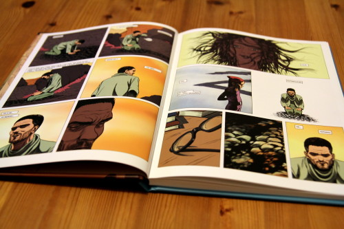
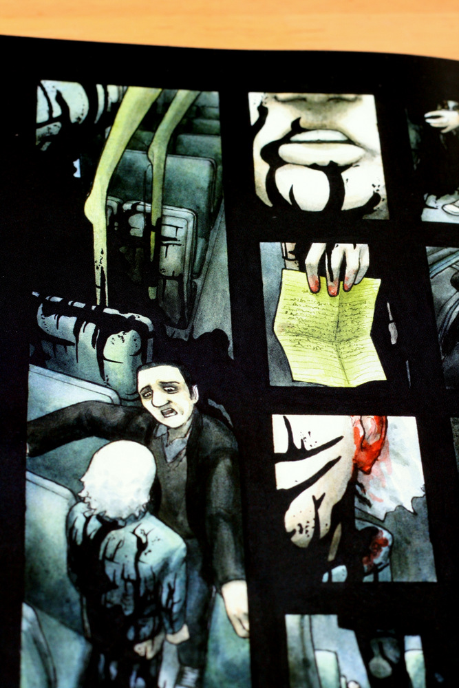
You turn through from its Big Weird Sci-Fi cover, cigar-smoking robo-chimp and all, to something so very close - completely scoped to one man. The panels lengthen and expand with the visual sweep. It begins with a hand, tight, clear detail to the front of the panel, moving out to an emptier background, controlling focus and scale like a classic Dali landscape. The next, twice the size, is a face, flat on the earth and weeping. The final two panels of the page, larger, then larger again, are full-width strips, expanding back  to show the man in a crater, and the crater in an odd, but not yet wholly-fantastical landscape.

I'm not going to take the whole book frame by frame. But from here it pulls out more, tracked close on the man - Verloc Nim - as he composes himself  and takes in his surroundings. It's a full five pages before he rises to his feet, aided up by a creature with the torso of a gorilla and the legs of a scrawny man, and the oddity of the world comes breaking in. Nim's memory is vague, amnesiac, and his body is unfamiliar to him. Once near-sighted he has perfect vision. The gorilla/robot introduces itself as Churchill, and hands Verloc his diary, encouraging him to read it as they make their way back to "the colony".

So begins a moderately conventional memory/self-recovery narrative, with an emerging past intertwined with an exploratory present. Verloc walks across this alien dessert while showing us the past that will eventually lead us to it.

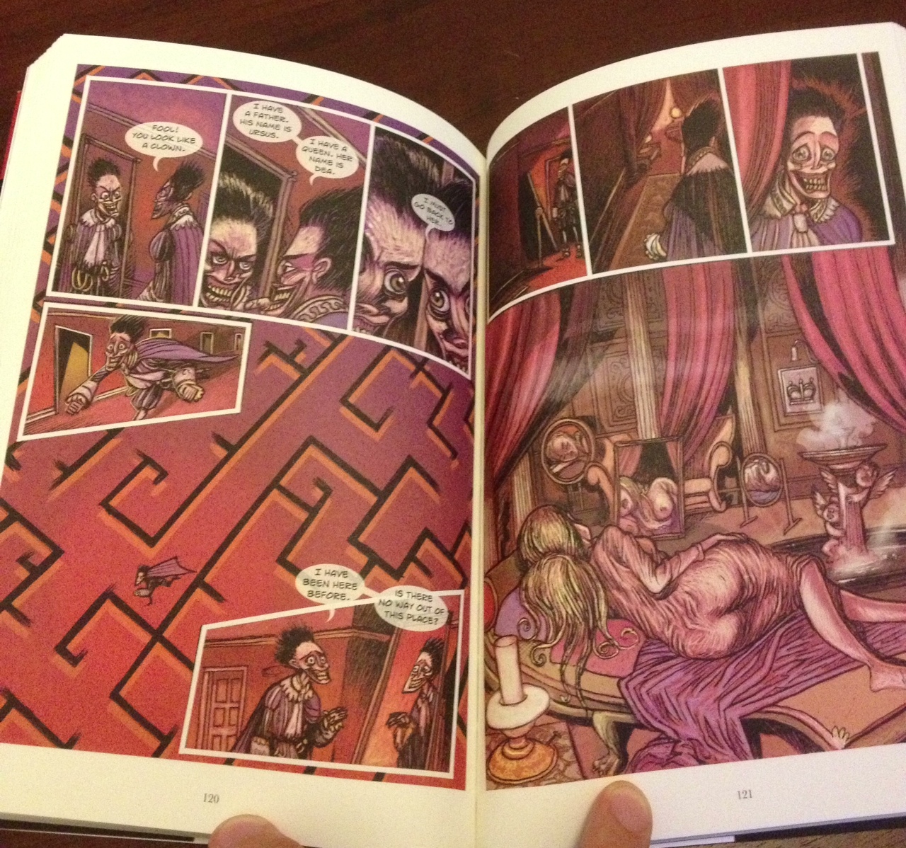
Here, if it hasn't already, is where a double-headed penny drops. On one side, the rough outline of Joseph Conrad's Adolf Verloc, on the other, Alejandro Jodorowsky's John DiFool.

Like both, Veroc Nim is a kind of feckless down-and-out hero refusenik. The narrative of his past begins with him also face down, stoned out of his mind in puddles of his own filth on the lowest levels of a towering future megacity. The shades of The Incal's setting are fairly clear. There's both early narrative and traits in common here with DiFool. Although with mercifully fewer cack-handed tarot references. Like Conrad's Verloc, too, he's a dealer of books and bric-a-brac in the seedy side of town, and a fidgety indolent; unable - quite - to lift himself out of his malaise or circumstances.

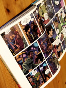
In this Veloc's case, that malaise is an epic drug bender that began after losing his livelihood to a confidence trickster, and his wife and child soon thereafter. He's rescued, without explanation, and by seeming coincidence, by his estranged brother - a kind of corporate fixer and gun for hire, in the pay of a shady megacorp we soon discover to be responsible for much of the decay and destitution Peeters draws around them.

Peeters has also come right out and called the brother "Conrad". I'm just going to leave that there, along with some vague allusions about authorship and creation (indeed, Conrad physically modifies Verloc as the story progresses), and then point out that it's still less painful than "DiFool".

Aama - city scenes
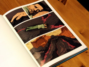
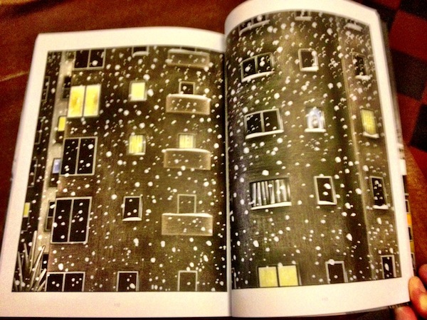
Together, the brothers embark on a mission to find a lost colony. It's one of the corporation's experimental outposts, home to some kind of nascent indistinguishable-from-magic biotech, from before the "Great Crisis" six years ago, when contact was lost. As they travel, Verloc recounts more of his past, and we see some gorgeously crazy and abstracted world design around them - spiky geometric spaceships, odd little bubble cars, slums full of mutants, and drug dens in dense, oppressive deep hues. Peeters' colouring does a lot of heavy lifting here. Each locale has a palette, with the range of colour expanding and compressing with the mood and tone of the action. The city is blues and purples, oppressive and close. The colony landscapes are expansive, higher contrast greens, browns, and yellows, with the colony outpost in claustrophobic reds.

The panel flow and guttering, too, remains regimented in the most part. It slices out time, until suddenly it will pull in tight on a person - a face or gesture, sometimes outside the main panel structure, for moments of emphasis or extreme emotional reaction.

In a few moments of extreme action, the guttering becomes slanted, the panels more weirdly geometric, mimicking either motion lines or a sense of general chaos. So when Churchill fights one of the colony's rogue robots, the otherwise highly regular, measured structure fractures into something far more kinetic.

The colony itself is a mystery. It's key scientist, Woland, has absconded, and taken her discovery ("aama") with her. By scant implication, aama is some kind of mystical possibly-terraforming nano-goo. This could easily all go a bit Star Trek II. As Verloc and Conrad bicker with the remaining faction, a child strolls in. Mute, and identical to Verloc's estranged daughter Lilja, she appeared without explanation, a week before.

Nods to The Incal's Solune are there, but without all the incoherent yelling about hermaphrodites. Aama teases us with an actual puzzle, rather than mere bad writing.

Aama - in the dessert
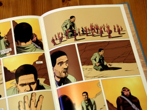
As the first volume ends, the Verloc in the present is walking back to the colony from who knows where. His memory is in tatters, and he's beginning to believe he can feel the landscape try to speak to him. The Verloc in the diary he's reading to us is about to set out into that dessert to pick at some of these mysteries. The colony is degenerating into a tiny cult, and the outpost is under siege from its own robots.

It's weird and it's intriguing. The characters' motivations are hazy, as is the structure of just what is going on. But unlike The Incal, this has a feeling of definite construction. It smacks of something coherent playing out, rather than of being written, tone-deaf, from one panel to the next. It looks like Mœbius' mad sci-fi world, for sure, and there are enormous parallels of structure and character. The colouring and landscape design are even similar.

But there's a clue to the difference, I think, in just how many of Aama's panels focus keenly on Verloc's face, and how expressive it makes his eyes. This is full of actual people who seem to feel things.

It's also full of effects that follow on from coherent causes, which Jodorowsky really wasn't so hot on.

I don't know what's going to happen to Verloc Nim - the persistent, gently tragic thwarting of Adolf Verloc, the gender-bending nonsensical back-seat apotheosis of John DiFool, or something else entirely. There are plenty of tropes Aama could lean on, and it's wide open to play games with the reliability of its narrator and its reality. Quite apart from being beautiful, it's going to be enormous fun finding out.


Battling Boy - Paul Pope

To say that with Battling Boy Paul Pope owes a debt to Jack Kirby would be to understate things drastically. By Pope’s own account the seed of the idea that eventually became this book was when an attempt to pitch DC Comics a revival of Kirby’s 1970s teen-in-a-post-apocalyptic-world, Kamandi, was met with the response that DC didn’t make comics for kids any more, but “45-year-olds”.

Battling Boy Do I Have To Wear the Cape

It’s hardly surprising then that the influence of Jack Kirby is all over this book, from a floating technological fortress filled with gods, to the look of the characters (Battling Boy’s dad looks like the halfway point between the Silver Age Thor and Kirby’s Fourth World character Orion, another character looks suspiciously like Big Barda). The style is all his own though, Pope’s manga-infused frenetic inks as distinctive as ever.

For a self-styled “comics destroyer”, Pope is nothing if not a contrarian, setting out thoughtfully to create a kid-friendly comic that captures the joy of coming across fragments of these grand mythologies as a child - a character here, a huge, never-to-be-explained machine there. It stops at tribute though - Pope’s own inventiveness doesn’t allow it to descend into magpied pieces of someone else’s work.

battling_boy_ghouls

Arcopolis is a city under siege from monsters. The city’s champion, Haggard West, and his daughter Aurora protect the city as best they can, but when Haggard is killed Arcopolis is left broadly defenseless. Meanwhile, Battling Boy’s parents must select somewhere for him to prove himself as a hero - something traditional for his people when they are turning 13. And so a city full of monsters has a teenage demigod - dressed like a normal kid, save for a huge red cape - thrown into it, and Battling Boy needs to find his place in a world he doesn’t understand. It’s rich stuff, but it’s hardly the “chosen one” mythology so prevalent in modern children’s literature.

Battling Boy’s main concern is living up to his parents’ legacy (they’re a lot more impressive than they are supportive, it has to be said), and his unworldliness leading to the adults of Arcopolis (or more realistically, the government - this is Paul Pope, after all) trying to exploit him as both their protector and something they can take credit for. It’s far more coming-of-age story than epic sweep, and the story stops somewhat abruptly - to be picked up again in a follow-up volume and at least one spin-off, The Rise of Aurora West (to be drawn by the fantastic David Rubin - hopefully this will lead to an English translation of his mythological / superhero comic, Le héros). There’s also a preview comic, The Death of Haggard West, but all of that is included in this volume, so it’s not necessary to track it down separately to read or enjoy Battling Boy.

I've praised Pope's artwork before, and it's just as good as ever in Battling Boy. His line seems a little finer and neater than usual - this could just be the reproduction; the book is quite small. Whatever the cause, it suits the bright and clear world of Arcopolis. In the monster underworld, more of the inky squiggles and sound as texture that have been prevalent in his work creep in - and it works, given these scenes a slightly grubbier, more B-movie feel (a chainsaw in a guitar case helps with that) next to the much more straightforward overworld.

Special praise should be given to Hilary Sycamore’s colouring. Pope’s work to my mind usually looks better in black and white - his freehand inks don’t really suit colouring in the standard line / ink / colour process. Just look at something like Batman: Year 100 for an example of where colouring genuinely detracts from his art (or compare the recoloured reissue of The One-Trick Rip-Off to the original black and white version). In Battling Boy, though, Sycamore has chosen a limited, mostly-flat palette that works well with Pope’s kinetic linework. That the backgrounds are less packed with detail than is often the case with his work helps. I also didn't realise the book was lettered digitally until seeing the credits page - digital lettering usually makes my brain itch, so I'm chalking that up as impressive.

There's a trailer that gives a surprisingly decent feel for the comic here:

[embed]http://www.youtube.com/watch?v=xK2AR9z4j5Y[/embed]

Battling Boy is excellent and, much as it feels strange to recommend Paul Pope for kids, I wholeheartedly do. Adults too, and in particular Silver Age aficionados. First: Second, who published this, are still on track to publish another of his kid-friendly works in the near future - the long-hibernating THB. When it finally reappears, I'd recommend that too.

The Infinite Vacation by Nick Spencer and Christian Ward

This one's a bit high-concept. The Infinite Vacation requires a bit of familiarity with quantum physics (the firing-particles-at-a-sheet-of-metal kind, not the nonsense-hand-wavy kind).The Infinite Vacation The relevant bits of quantum physics in brief: some particles exist as a wave of probability - it’s not until they're observed that they have a fixed position. Therefore, they exist at all possible points at once until they are observed, at which time the probability waveform collapses to a single point. In Many Worlds Theory, this sort of probability waveform is thought to apply to the whole universe, but the waveform never collapses, so every possibility spirals out as its own parallel universe.

The Infinite Vacation is a marketplace app allows you to purchase another version of your life and switch places with the version of you living it - to switch one point on the probability waveform for another. The world that this creates is incredibly well-realised. The world has adapted to the technology as we do with any impressive burst forward - a initial flurry of excitement that rapidly gives way to accepting it as absolutely normal. There are small, luddite-like groups of organised abstainers, but that's about it.

Mark is a serial vacationer, jumping from life to life in pursuit of the life he wants (something he can’t identify), but always winding up repeating the same patterns, grinding himself down in a dead-end job, and moving on again when he can't take it any more. When it seems that someone is trying to eliminate versions of him from across all possible universes, he groups together with some other versions of himself to figure out what's going on.

I don’t necessarily like the art style in this book so much as appreciate it. What seems scrappy to begin with has the complexity and the brio to take a remarkably complex narrative and make it comprehensible. There are simple tricks like colour-coding for specific characters that help them stand out from the the sometimes highly abstract backgrounds, strong character designs to help distinguish an infinite number of Marks.

After a while, this sort of thing starts to make sense.

A word of warning: there are some genuinely unpleasant scenes - needless to say, with infinite variations of each person, some of those are not very nice. These seem to be played for stakes rather than as Mark Millar-esque shock, but that doesn’t prevent them from being deeply nasty to the unprepared.

It's not that this is the first time many-worlds theory has been tied to a story in this way, but the execution of The Infinite Vacation is superb. Major story themes are directly mapped to elements of quantum theory in a way that is comprehensible without being trite, forced, or overexplained. In the last big action beat of the book the way the art, writing, and the overarching blend of the story and physics come together in a genuinely virtuoso sequence. I have a genuine love for anything that marries theme and plot this tightly - it's one of the reasons I love Alison Bechdel's books. If you have a similar love for that sort of arch-structuralist work, or just something that will make you swear under your breath at the authors' cleverness, The Infinite Vacation is highly recommended.

The Man Who Laughs

The Man Who Laughs David Hine Mark StaffordArtist: Mark Stafford

Writer: David Hine, adapting Victor Hugo

Any mention of The Man Who Laughs, especially in relation to comics, must start with the fact that the story’s protagonist, the disfigured orphan Gwynplaine, inspired Batman’s nemesis The Joker. With that legal requirement out of the way, let’s look at this graphic novel adaptation of Victor Hugo’s novel.The Man Who Laughs Gallows SceneDavid Hine (writer of the bizarre and brilliant Bulletproof Coffin) has adapted Victor Hugo’s rambling tale of class, nobility (the other sort) and betrayal into a lean graphic novel. Mark Stafford’s art is the main draw, creating a world populated with angular, sickly-looking people and stark landscapes. There are sections that look like woodcuts, and some genuinely astounding layouts. The sickly candlelight that bathes the characters gives a gothic feel to the proceedings that arguably doesn’t exist in the novels, but it’s so stylish and feels so appropriate to this telling that it’s hard to complain.

If there’s one criticism to be leveled, it’s that the production can occasionally look a little too digital. Hand-drawn lettering would definitely suit the art style more, and the colouring is occasionally a bit rough - there are some panels where the digital brushwork stands out to a distracting degree. These are minor concerns - the artwork is mostly superb.The MAn Who Laughs Mark Stafford Layouts

The story is akin to the Good Bits Edition in the novel version of The Princess Bride - it makes for a far more readable take on the story. What it loses though, is the constant wry yet furious presence of Hugo in the prose. The book was written while Hugo was in exile in Jersey for his republican beliefs, and his distaste for the class system and the upper classes in general drips venom from the pages. Some of that is present in this adaptation - “The people rejoiced. In the time of Cromwell, speech was free, the press was free. England had been in a dream. Where should we be if every citizen had his rights? Was ever anything so mad? What joy to be quit of such errors!” - but what the story gains in brevity it definitely loses in the absence of some of the ripest prose. Still, this is a strong adaptation that makes some bold and vital choices that were definitely needed to succeed as a graphic novel. It's probably better for those who've already read it as a novel, but it works in its own right.

The Subtle Art of the Reboot

Swamp Thing Reboot WingsLong-term comic readers, at least those who read the superhero output from Marvel and DC, will be used to the ground shifting under their feet. New readers are vital to the industry, bringing in new money, but the long-term readers reliably provide cash as well, and have huge emotional and financial investments in the characters and universes they enjoy. Surely there must be a way to satisfy these new readers, with a cursory notion of the characters and a need for a gentle introduction to a complex, long-running storyline, and still keep those older fans and their prolonged engagement with those characters, stories, and creators? Not really. But there are reboots. Some better than others. In the tussle between art and commerce, art doesn’t often come off well.

In the 80s, Marvel’s then-editor Jim Shooter decide to introduce the New Universe, an entirely separate continuity and set of stories. It was never great, and it was cancelled after 170 issues across a range of titles. In the 90s they decided to reboot their main characters into a bubble universe called ‘Heroes Reborn’ in a bit of narrative wrangling designed to get former Marvel stalwarts (and highly popular artists) Rob Liefeld and Jim Lee back onboard. This continued from where the stories were at the time, but reset everything to a new beginning via some genuinely torturous logic. It ran for a few years, but then everything quietly got shuffled back into the main continuity again via the same hand-wavey non-logic that started it in the first place (that Lee and Liefeld were as late with their art as they had been as full-time Marvel employees probably played a part). Possibly the most egregious attempt to reboot a character was the Spider-Man story The Clone Saga, a story designed to wipe out Spider-Man’s marriage by revealing that a clone from a storyline in the 70s was the real Spider-Man, meaning that he was still single, carefree, and far more commercially viable. And if that makes your skin crawl it’s not your Spider-Sense tingling. That this attempted reboot and simplification was just overwhelmingly complicated and long-winded was the final insult (until the One More Day storyline wiped out Spidey's marriage again a few years ago).

Like, whoa. Alan Moore's Swamp Thing, art by Steve Bisette

In the early 80s, Alan Moore effectively rebooted the third-tier character Swamp Thing when it was handed to him to write. He took what was a character born out of the horror movie culture of the 70s and 80s and made it something far more interesting, converting the character from a confused monster into an avatar of all plant life on the planet. He kept a lot of the horror tropes, but introduced philosophical and psychedelic elements that broadened the series from a story about monsters punching each other into something much more interesting. It told the sort of dark, smart stories that formed the foundation of the DC’s Vertigo imprint. A few years later Grant Morrison pulled the same trick with Animal Man, taking a character that had never really been popular and creating a critically and commercially-successful comic by rewriting a goofy superhero story into a weird metatextual story in which the author and main character frequently interacted, even argued. Neither of these takes was the original, but they were huge improvements on how the characters had been used before, and both proved more commercially successful as well.

Since then there have been various Crises and other cataclysmic events bringing changes and refreshing the publishing lines of the big two publishers, but 2012 was notable for bringing two big relaunches near-simultaneously, with DC’s complete line revamp, The New 52 and Marvel’s Marvel Now! comics designed to bring in new readers.

Now both Swamp Thing and Animal Man have been re-rebooted as part of The New 52. These titles used to be second-or-third stringers, but now they're beloved representatives of what mainstream comics can be, and the early works of two of comics' most-lauded creators. And yet both reboots have been (great) critical and (moderate) sales successes. Swamp Thing is handled by Scott Snyder, a proven horror writer who knows how to get to the Southern Gothic notes that work so well for the character. Yanick Paquette brings a more mainstream illustration style than normally used with the character, but it works.

Animal Man Jeff Lemire

Animal Man takes a character that was never as well thought-of after Grant Morrison's run ended, and turns it into something it had never really approached before - Cronenbergian body-horror. Jeff Lemire has plenty of experience with weird horror in titles like Sweet Tooth, and this was well matched in ghoulish illustration by initial artist Travel Foreman.

Both series do something new, are well-written and play to the strengths of their respective writers and artists. "Take the characters, give them to good writers and artists, and let them take creative risks" might seem like an obvious bit of advice to give, but the execution is the hard part. Gail Simone turned an enormous backlash at the rebooted Batgirl into a massive outpouring of support when she was removed from the title. Conversely, Grant Morrison on Action Comics / Superman should have been a sure thing, but it fizzled out impressively. Still, the bold reinvention seems to be the closest thing to a formula for success when a character is absolutely going to be rewritten - Marvel have seen similar success with bold reboots of Hawkeye and Captain Marvel.

Much as it would be great for every writer and artist to be working on brand-new trailblazing ideas, an old character well-written is still an enjoyable and frequently interesting thing to read. And frankly, as long as Batman and chums get people into the comic shops, it's helping to keep the whole industry healthy.

Interiorae by Gabriella Giandelli

The interior of the title is both the inside of the Milan tower block in which the story takes place, and the inner lives - fears and dreams - of the tower residents. The plot meanders loosely around small moments in the lives of the occupants, generally taking in the quiet and the sad, as they ponder their own lives, generally oblivious to those around them. The plot rarely steps outside the apartment, compounding the idea that, while they are always surrounded by people, these characters are firmly locked in their own interior worlds. The Tower Block Interiorae

Atmosphere is key. The pencilled artwork is densely crosshatched - the tower block itself is a nest of shadows, whereas its inhabitants stand out as faintly luminous. It’s a brilliantly unsettling effect, suggesting a space haunted by its inhabitants, but always more unnerving than outright scary or oppressive. Most of the tower’s inhabitants are unable to move on from something, be it a bad relationship or a slow decline into a painful death. While their stories don’t interweave strongly (the isolation is maintained almost throughout), they do sometimes push each other towards the change they need.

A giant, seemingly benign spectral rabbit wanders the tower, slipping between apartments and reporting on the occupants’ lives and dreams to his boss, a formless shape who lives in the basement. This suggests Haruki Murakami, Alice in Wonderland, or even Harvey, but the tale never slips too far from the everyday lives of the denizens of the tower into outright fantasy. There are strong magical realist tendencies, but it’s clearly the smaller moments that interest Giandelli. That’s not to say that the rabbit and his mysterious boss aren’t important, but they don’t steal focus from the everyday folk - they’re more of a Greek chorus, albeit less critical, always quietly hoping for the best for their unknowing charges.

Interiorae The Boss

In less capable hands this would be the setup for spiraling into madness or sudden revelation, but Interiorae is slower and more careful than that (one overly abrupt moment towards the end aside). It warrants and rewards multiple readthroughs - there’s a wealth of detail and atmosphere to absorb.

The Silver Darlings

The Silver Darlings Cover Image

The Silver Darlings

Will Morris

Blank Slate Books

Danny is a young man about to set off for university, the first in his family to do so. In the quiet summer before he leaves, he’s going to work on his father’s fishing boat. Keen to prove his intelligence and sophistication, he’s decided to undermine the fishermen’s superstitions while he does so, sneaking on some contraband that has connotations of disaster.

It's not a grand tale, but what’s really impressive about The Silver Darlings is the quiet revelation that unfolds over a few short pages. What could have been a hectoring tale of hubris instead unfolds gently, almost serenely, and is given room enough to breathe that it feels natural. There’s so much going on - Danny’s desire to escape his small, ailing town, his self-constructed myth of a sudden and revelatory transition to adulthood, his immature urges to prove himself smarter and more urbane than his father and cousin - it’s all handled in such a deft way.

The Silver Darlings Fish Formations

Angular lines and soft inks are a pretty striking combination, and the art style is so assured that it's genuinely surprising that this is Morris' first work released as a graphic novel. As a book, it's a beautiful object, the printing capturing every little detail in the inks and the texture of the original paper. Most of all though, The Silver Darlings is a small, quiet story, excellently told.

Adamtine - devils and details

It's going to be hard to review Hannah Berry's Adamtine without spoilers, so I'll start with a tiny one to get us going: the crossword solution is "rhadamanthine"; the missing letters make up the book's title. That's not much of a spoiler, but it fills in a blank, a tiny detail. If you do know the word - and I had to look it up - it adds a layer, too. That's kind of the real spoiler: Adamtine is built up of these details and layers, and I'm going to talk about that. The plot has twists and reveals, and I'll try not to spoil them too much, but what really got me was how well the book is assembled to produce its effects. Hopefully, me banging on about how well Adamtine creates atmosphere won't spoil it doing that for you, but if you think it might, go and buy it and read it first. Really, do.

You can download a preview from Hannah Berry's website.

Adamtine 1

It may actually take less time to read than this article. I loved Adamtine, and got a little carried away.

Enough gushing; let's talk about the unutterable. The book's title is the missing piece of a crossword puzzle its characters can't solve and are disoriented by. The most they can manage is "it's not Righteous", and the clue is later fed back to them by the narrative, posed to them over an abandoned intercom by what emerge to be themselves a few minutes in the future. Freaky, huh? It's a neat little microcosm of the story itself - something threatening and inscrutable pressing in on its participants with a grim ironic advantage.

Oh, and it has to do with the judgement of the dead. The word "rhadamanthine" derives from Rhadamanthus, a minor figure from Greek mythology, a king of Minos associated strongly with the rule of law and inflexible justice. In the afterlife he is a judge of departed souls. The resonance in Adamtine is clear, as something judges each of the characters, first handing them a note that accounts for all of their transgressions, and claiming them after the narrative has taken us back through the memories of their guilt. But taken with some of the story’s eerier impossibilities – the loop of space and time between the two carriages, the complete matt blackness outside, the spectre of Rodney Moon, it offers us perhaps a slightly different kind of ghost story.

Adamtine doesn’t commit to this, indeed, it doesn’t commit to many certainties, but we may be witnessing either these people’s disappearances from life, or just as well their transition and judgement as the dead.

Adamtine: a slippery abstraction of “uncompromisingly just”, something unknowable, and definitely “not righteous”. Cool, but what’s it about?

Adamtine 3Four strangers are on the last train home. It is stopped in the countryside, decoupled from the other carriages, and it is pitch black outside. There is something in that darkness, and one by one, as their connections emerge, the characters begin to disappear. That's the basic structure of Adamtine. It's a pressure horror, a kind of Pitch Black for tired commuters with mysterious pasts. But this isn't a visceral horror of jump cuts, it's something more emergent and creeping. The thing in the darkness is the darkness - it's not distinct, and it seeps in from the pages' black gutters like running ink. It's a very immediate distortion of the characters’ present reality. The pages in the now have black backgrounds, the characters' recollections are white. The darkness pressing in is the boundary of the panels, the space outside the characters' knowable world. When it intrudes, coming for them, it decomposes the panels' hard edges and bleeds over their contents with flat black.

The bleeding is no accident - the shape of it suggests blood, and a lot of it. But there is no overt gore in this present. Those claimed by the dark simply vanish. Blood is reserved for the memories, for the past each of these characters contributed to. All of them played a small part in the death of a man: Rodney Moon, a serial murder suspect widely vilified. They find themselves now in a situation that reprises the circumstances of those murders.

Adamtine isn’t – overtly – an angry screed about justice in the court of public opinion, but it’s certainly set against that process playing out. Moon’s acquittal is deemed illegitimate by a public and media assured of his guilt. His defence is occult and implausible. Each of these characters believed him guilty such that they acted (or failed to act) in a way the ultimately lead to his murder. The moments we see of their pasts are largely the moments in which they decided his guilt, and the unacceptability of his innocence. Moon himself offers no comment. He has two words in the entire book. We never clearly see his face, and we are given no way to ourselves assess his innocence. Do we sympathise? Perhaps, but we must choose to. We perceive him only in terms of the thoughts of others. Even before his vengeful spectre haunts the train, he is an unknowable presence.

Uncertainty and unsettlement (indeed, Uncannyness) are a big deal in Adamtine. Two of the characters walk from one carriage to the next, a distance up the tracks, only to find that it is the same one and the objects they have discarded have reappeared. On their journey the dark presses in about them, and they’re drawn faintly, pallid. Their word bubbles are the clearest thing on the page, and as our eyes adjust to the contrast, and their conversation shifts around to their secrets, Moon’s abstracted face looms in from the gutters. You don’t necessarily even see it at first, or you half see it, uncertain as to what, quite, you've seen. It’s a beautiful piece of composition, and it’s part of the tracery of little details that hold Adamtine together.

Hannah Berry talks about this in a little detail in an interview with Forbidden Planet, discussing the ways in which detail builds horror. It’s well worth reading. In the same piece she makes the same remark she did at Thought Bubble – that there’s something especially torturous for an artist in setting something entirely on a train. The volume of finicky repetition must be exhausting, for sure, but it really pays off in those details.

Adamtine 4For example: the train windows. They’re meticulously shaded to show reflections in the darkness; until they’re not. Windows, doors, any glass surfaces in Adamtine behave realistically with very few exceptions, and those exceptions are not errors. Nobody got lazy here. When the windows are matt black, it’s because they’re no longer looking out into the darkness. Whatever is coming has started to envelop the carriage and is moving towards its victim. It is as though the windows are looking out directly at the gutters, as though the situation is no longer quite real. This is telegraphed most strongly for the first disappearance – Moon’s face appears, the blackness occludes the landscape outside, a man limply holds a crabbed little note, aghast, a door opens onto nothing, and through it the ink bleeds in from the gutters; he vanishes.

It happens each time. Would it be glib to call it a kind of visual pun? To suggest that when there is no longer reflection, certainty has come for you? That may be a critical over-reach, but impulsive certainty and black and white morality are at issue here.

So: creeping details, a liberal dose of the Uncanny, impossible topology, a little Greek myth, and a complete evasion of certainties in discussing the consequence of impulsive certainty. That’s quite a laundry list for Adamtine. There’s plenty more going on in the book, for sure. I haven’t even mentioned characterization for instance. But the last one I’m going to poke about in is pacing an visual attention. It’s just brilliantly done.

Adamtine’s panels are by and large small. They often focus on a tiny detail of action: a hand on a cup, a shift in expression or posture. They slice time into tiny definite pieces, and in those slices move the flow of time very deliberately. To read Adamtine quickly is to do so inattentively – the composition demands a degree of lingering.

Damatine, closeup of detail panels

One of my favourite examples of this is a page that utterly decompresses a few seconds of domestic tragedy. It begins with a plate smashing, held, frozen by the image. It skips into bursts of emotion, and then slows right down. The plate shards are juxtaposed as  a long panel next to a kitchen scene, and the sequence ends with a still closeup on a boiling kettle, itself split into two panels. This splitting of a single images recurs through Adamtine (and also Britten and Brülightly), either forcing us to linger on a detail as time passes around it, or superimposing the progression of narrative on something still and quiet. The panel division asks us to read the passage of time, the still image refuses, the eye almost bouncing off it. Plenty of cartoonists do this, but I've rarely seen it used quite so effectively to play with pace and attention as in Adamtine.

This technical excellence is not why you should read Adamtine – you should read it because it’s a brilliantly atmospheric horror story, well characterized, non-simplistic, and chock-full of great moments. But if you’re at all interested in how comics work then the way Adamtine is constructed is fascinating. Its use of detail and the emergent atmosphere are spectacular.

Paul Pope and the One-Trick Rip-Off

The One-Trick Rip-Off Paul Pope has always been something of an artist’s artist, which is why a collection of his work selling for three times the cover price yet you can still rarely find any of the comics he’s created on the shelves. He first appeared in the mid-nineties, with his weird sci-fi tale THB, about boarding schools and giant genie-like creatures that spring into action with the addition of a drop of water. At the same time, he was starting to work on Supertrouble for manga publisher Kodansha. Supertrouble never really appeared, and THB trickled out spordacially, making it hard to collect for even the most dedicated. Heavy Liquid

Sporadic unavailability of his work has been something of a trademark. In 2007 he curated a retrospective of his work, called Pulphope, which quickly became impossible to find (pro tip: do not look at prices on eBay if you've ever given a copy away, it's sickening). Thankfully for those of us who want to own one, Legendary Comics are issuing a new version with additional material in March. In addition, Image are republishing The One-Trick Rip-Off (originally published by Dark Horse) with Deep Cuts, a collection of Pope's mid-90's work (including Supertrouble). Some more recent work will appear in June, when DC finally collects their artist showcase Solo series as a hardback (all of the artists covered in this series are worth looking into).

Paul Pope's Joker from SOLO

So why should you grab an opportunity to pick up Pope's comics while they're (hopefully less temporarily this time) about? Because his art is unlike anyone else working today. His brushwork is wildly kinetic while still brilliantly precise. Even when he's writing weird sci-fi, he still writes people well (most of the time). Because even when he's not at his best, he's still more interesting than a lot of stuff on the shelves. And because, after years of dallying with the mainstream, it looks like he might be big enough to make a dent under his own name. Good as Batman: Year 100 was, it needed Paul Pope more than Paul Pope needed it.

At the very least, check out the frequently-in-print 100%. A series of interweaving stories based around the lives of a group of people working in and frequenting a bar - hardly the most original idea, but so deftly handled that it deserves to be read. So do.

The Lengths

The Lengths - covers

 “I guess every coming of age story winds up reading like the emo Tumblr suicide note of the child you’d thought you’d always be”

Howard Hardiman’s The Lengths was picked up in the New Statesman this week. They've had a lot of good comics writing lately, and this was no exception. After picking up The Lengths myself at Thought Bubble this year, I’d say it definitely deserves the attention.

It's the story of Eddie, an art school drop-out struggling to hold his relationships together, and Ford, a fledgling rent boy with a broadening callous streak. They are the same person, and The Lengths is about tangling and untangling those identities.

In a few fairly superficial ways it’s not unlike Not My Bag – it’s an identity story, text heavy, in heavily stylized monochrome. It’s about how a couple of impulsive decisions and a cloud of temptations lead a rather naïve protagonist down a trail of forking identity, and the quiet little revelation that eventually leads him back. Only, the protagonist in The Lengths sells his arse rather than designer sweaters, and he has the head of a dog.

The Lengths - end of issue 1

Actually, let’s get the dog thing out of the way now. This is not Disney. It is not Redwall. In places the style is scratchy and brutal and it certainly isn’t cute. Some of the dog breeds are used to quickly telegraph traits, others just to give characterful faces. They’re aggressively physical, and the human/canine disconnect emphasises that. There's two types of incongruity at work here, and they both help grab attention. One is just having dog heads on the bodies of what often look like underwear models, the other is that this isn't your kids' section talking animal story. When these dog-people play video games, or have coffee, or nosh each-other off, it can just spark a bit more attention that it otherwise might. It's a little flourish, and it's not overplayed.

It may not be overly saucy and explicit, but The Lengths is not shy about its sexuality. In places it almost has a swagger. The seasoned-escort Nelson in particular is like some kind of improbably-buff BDSM Anubis with a torso from the wrong end of a Rob Liefeld sex fantasy. Seriously. I’d love to believe he’s a joke about that Captain America cover. And again, his bull terrier head just foregrounds the aggressive physique.

Stylistically, The Lengths is an odd one. It uses actual panels very sparingly, more commonly layering images around each-other and using a lot of whole page layouts. Text floats, and images associate spatially, often radiating around the point of the page’s focus. That focus is typically Eddie, and often his memories. The book is told through his experiences, and the world often flows around him, surrounding him with images and collapsing into panels or expanding to a page spread when it brings him up short. Visually, it’s fantastically structured.

The lengths - page 1

In fact, that's largely why I bought it. The first page kind of suckered me. The amount of character creation and tone setting it gets done with almost no words and very few lines is impressive. The world feels real, too. Chatting very briefly to Howard at Thought Bubble (he’s utterly lovely, incidentally) he spent a lot of time researching it. The story is not documentary, it’s not a broad exploration of the sex trade, for instance. But it rests on top of a series of interviews and conversations that help make it feel concrete, plausible. Likewise the relationships – the group of friends and boyfriends and casual encounters it’s spun around, they have defined, neatly-crafted tones of voice. The geeky milieu makes me think of people I know, or certainly people I've met.

It's sweet in places - it's built around a gentle, tentative love story. Getting together with Dan forces Eddie to try and reconcile his two lives. Through that stress he explores previous relationships, wrong turns, and how he ended up here at all. The ending (again, similar to Not My Bag) is self-awareness and the start of something rather than big denouement fireworks.

I picked up The Lengths for the first page, for being a bit striking and visibly well-constructed. That stays true throughout, and I'd recommend others picking it up not just for that style, but for the character work that carries through it.

Fatale Roughs Up Gender Tropes in a Dark Alley

A brief note: I’m using noir in this context to refer to both film noir and noir-ish detective novels, because otherwise it’s just an exhausting exercise in drawing ever more granular distinctions that no one bar three obsessives cares about, and it also fails to inform upon this context. Still here? Good. Let’s go. Fatale

Noir has a troubled relationship with women. Yes, its heroes are meant to be flawed. Greek legend levels of flawed. These people get stuff wrong, a lot, and I appreciate. A lot of noir is still fiercely misogynist, which is problematic, in an enjoying problematic things way. There’s plenty to love about those stories, but the general treatment of women is not one of them.

Fatale (by Ed Brubaker and Sean Philips, who together know more than most about crime fiction) takes the weary femme fatale archetype and subverts it brilliantly. Josephine, the titular character, is a femme fatale that has the role thrust upon her - a murkily-defined ritual has given her the power to manipulate men, and has left her on the run from people far scarier than the usual mobsters and hitmen (of course, these figure). She resents it, fights against it, reluctantly employs it when it’s a matter of using it or surviving. It’s not a million miles away from the usual sad, desperate and manipulative women of noir stories, but it’s that closeness when combined with the crucial differences that makes it a worthwhile comparison.

In creating a character that is aware of her own role in the story, Fatale allows Brubaker not to just use the trope in a modern setting, but also examine and deconstruct it in a dramatic setting. There’s nothing especially campy about Fatale (as there usually is with any post-modern take on noir or pulp), it's just a pulp story told in a framework that allows it to both treat the story and the genre with a certain authenticity (give or take some cosmic horror), while allowing its female lead to be a stronger and more interesting character than the form usually allows.

It’s not the first comic to attempt it. Brian Michael Bendis’ Alias places a female character in the gumshoe role (in the Marvel Universe no less), and doesn’t clean it up in any way. It strays in some ways (superpowered rape analogies, for one thing), but it's still an interesting take on the genre. Both are worth reading, but Fatale is worth picking up now. It's recently been expanded into an ongoing series, and with good reason. Beyond all the clever deconstruction, it's also just an excellent crime / horror tale.